
Space can make or break a design! It is something that needs to be spot on. Think about what’s not there. Think about what is there. Think about what has been left as clear and uncluttered space and where forms and shapes have been purposefully placed.
The right use of space
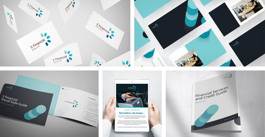
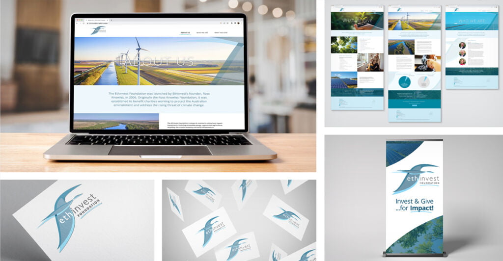
Whether you are designing a company logo, a property brochure, an annual report, or a website it is essential to get the use of space right! Graphic designers bring a good awareness of space to the creative drawing board.
How is space considered in design aesthetics? Space can be thought of as the distance between and around design elements, sometimes referred to as white space by graphic designers or negative space. Space can also be thought of in terms of shape and form which is often referred to as positive space by creatives. Graphic design artists know that effective use of space is absolutely one of the key elements when creating successful brochures, logos, reports, and websites.
One of the most important functions of space within graphic design is that it grabs attention!
When graphic designers think about the aesthetic of space during the creative process for things such as annual reports, or property brochures, they are usually thinking about how it can be used to create rhythm, direction, and flow. They are taking into consideration how space can be used to produce affects such as harmony, emphasis, scale, and balance.
Success of any graphic design project rests on a finished product that is aesthetically pleasing, right? Space has a lot to do with this outcome!
Using space effectively in logo designs, catalogues, and reports will lead to an engagement with a client’s imagination. When a client’s imagination is engaged it makes them more likely to connect with the meaning and messaging within a design project. Good graphic design that provides the opportunity for clients to let their imagination roam freely, making connections between elements where gaps have been left for example, ensures that information is absorbed more effortlessly.
Graphic designers use the space aesthetic to achieve specific outcomes such as emphasising the importance of certain information in annual reports and catalogues. Space can be used effectively to create visual hierarchy, group certain graphic design elements together or keep them separated and show clearly where sections start and finish. In the design of brochures, annual reports, and websites use of space allows for a less dense presentation of information.
Big blocks of copy have a dulling affect and are hard to engage with because of their lack of visual appeal!
Good design makes use of space in a strategic and well thought out ways. Knowing how to strategically use space in design aesthetics is a technical skill that graphic artists acquire through their professional qualifications and experience. The effective use of space is essential to the success of any brochure, website, annual report, catalogue, or advertising campaign. Consideration of both positive and negative space in design can produce balance, draw attention to focal points, create visually pleasing imagery and convey more powerful and easily absorbed messaging.