
Everyone wishes they had a crystal ball, right? Well, the next best thing is to pick up on trends and use them to try and predict what will be popular in the future. From a graphic designer’s point of view this is a great way to keep fresh when it comes to creative design, concepts, and branding. Whether you are putting together a brochure, designing an annual report, or creating a logo design colour is crucial.
Colour can convey emotion. It gives the graphic designer an opportunity to communicate on a different level with clients and in turn their customers. Some believe that colour provides a gateway to the subconscious influencing reaction and behaviours. Whether or not this is true is up for debate however many texts on design principles hold out that saturated colours for example are good for attracting attention and are perceived as being more exciting and dynamic, whereas desaturated darker colours convey a more professional and serious tone.
Branding, and a brand’s position in the marketplace, can be significantly affected by colour choices made in the design of its logo for example. For an artist working as a graphic designer in an agency, knowledge of colour is just one very small component of a whole range of skill sets. However, this one component can be significant to the success of the overall look of a website or the design of an advertising campaign. Colour in design can be used to attract attention, group certain elements together, indicate meaning and enhance overall aesthetic. Without a good understanding of colour, a design project could hit a conceptual roadblock.
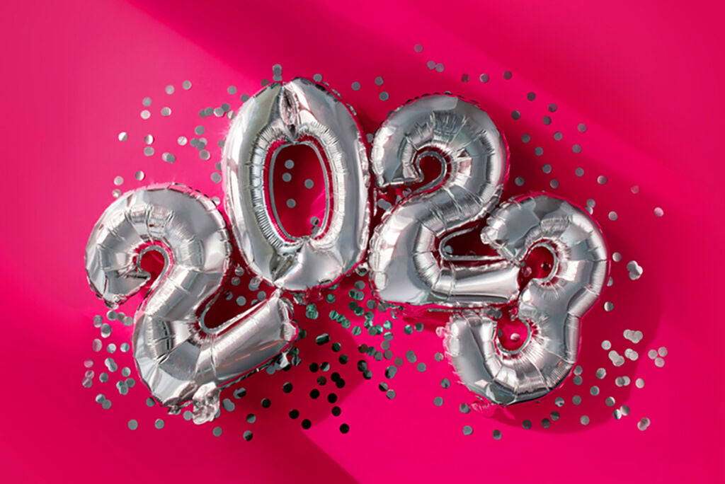
So, what is the most popular colour in 2023? For graphic designers they may look to big phone brands for what’s popular in the digital world or consider world events and how they are influencing brand colour choices and concepts. The colour that is attracting attention in many design-related blogs is Pantone’s named colour of the year for 2023, Viva Magenta.
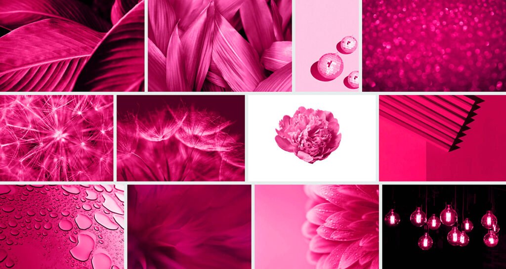
According to design industry commentators, Viva Magenta is a colour that embodies the concept of an optimistic future in its brighter shades. In its darkened version it reflects a more sombre mood. Bright shades of Viva Magenta are said to point to an optimistic post pandemic world that is embracing the exploration of new technologies whilst darker shades conceptualise a world of economic instability, wars, and climate change.
If you google Viva Magenta, it is described as a bright and vivid shade of pinkish purple. It is a synthetic colour that contains a mixture of red and blue pigments resulting in a boldness and vibrancy that is perfect for adding ‘pop’ to any design.