
I recently visited the The Art of Banksy Exhibition in Sydney, and I walked out thinking less about street art and more about communication. That might sound strange at first. Banksy is often discussed through the lens of rebellion, anonymity, anti-establishment politics, or spectacle. But standing in front of those works especially as someone who runs a creative graphic design agency what struck me most was how incredibly effective the work is from a design perspective. Not just aesthetically effective. Communicatively effective.
And interestingly, it immediately brought me back to another exhibition I saw a couple of years ago in Milan: the work of Shepard Fairey. Different artists. Different visual languages. Different political tones. But both reminded me of the same thing: Graphic design is one of the most powerful tools we have for shaping public thought, emotion, and memory.
Simplicity Is Not Simplicity
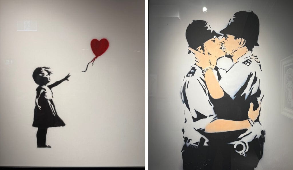
One of the first Banksy pieces that pulled me in again was Girl with Balloon. At face value, it’s incredibly simple: a monochrome stencil of a child reaching toward a heart-shaped red balloon. Minimal colour. Minimal detail. Minimal composition. Yet everyone understands it instantly.
Hope.
Loss.
Innocence.
Distance.
Longing.
The brilliance of Banksy’s work is that it operates like the best branding systems do: immediate recognition paired with emotional clarity. As agency owners and designers, we often get pulled toward complexity more layers, more effects, more messaging, more strategy decks. But Banksy’s work is a reminder that the strongest communication often comes from reduction, not addition. The red balloon matters because everything else is restrained. That’s design discipline.
The Graphic Quality Is the Message
Another work that stayed with me was Love is in the Bin the infamous shredded piece that transformed itself during auction. People talk about the stunt, but visually the work is important because it understands iconography. Banksy creates symbols, not just artworks. That’s something Shepard Fairey also masters exceptionally well. When I saw Fairey’s exhibition in Milan, I remember being struck by how heavily his work borrowed from propaganda systems, advertising structures, punk graphics, and political posters. Large typography. Repetition. Limited palettes. Hard contrast. High recognisability. The most obvious example is Hope arguably one of the most culturally influential graphic design pieces of the modern era. That poster transcended politics because it distilled an entire campaign into a visual shorthand.
One image.
One word.
One emotional direction.
That’s extraordinary graphic communication. Banksy operates similarly, although with more irony and subversion. His stencil aesthetic behaves almost like guerrilla branding highly reproducible, scalable, and instantly identifiable from a distance. From an agency perspective, this is incredibly relevant. The strongest visual identities in the world don’t just look good. They become symbols people attach meaning to.
Street Art and Branding Have More in Common Than We Admit
Walking through the Banksy exhibition, I kept thinking about placement. Street art has no guaranteed audience. No media budget. No controlled environment. So the work has to interrupt people instantly. That is fundamentally the same challenge brands face today.
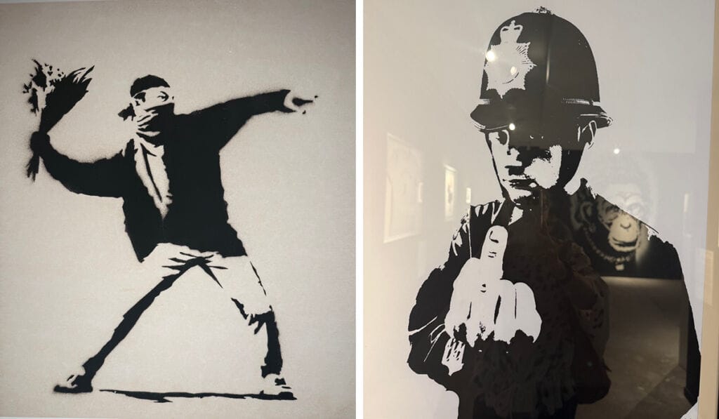
We live in an attention economy where every campaign, social post, website, and advertisement is competing against infinite distraction. Banksy’s success comes from understanding visual interruption at a master level. Take Flower Thrower. The composition mirrors violent protest imagery, but instead of a Molotov cocktail, the figure throws flowers. The visual contradiction is immediate and memorable because the concept resolves itself in a split second. That’s not accidental artistry. That’s strategic visual communication.
Great graphic design works exactly the same way: capture attention, create tension, deliver clarity.
The Power of Constraints
Something both Banksy and Shepard Fairey reinforced for me is the creative strength that comes from limitations. Both artists rely heavily on:
- restricted colour palettes
- bold contrast
- simplified forms
- repetition
- typography
- reproducibility
In agency work, constraints are often treated like obstacles: tight timelines, small budgets, limited formats, platform restrictions.
But these artists prove the opposite. Constraints sharpen communication. The stencil aesthetic exists partly because it allows speed and repetition. Fairey’s poster language works because it embraces graphic economy rather than excess. As designers, we sometimes forget that clarity beats decoration almost every time.
Design Is Cultural Participation
What also became obvious to me during the exhibition is that graphic design is never neutral. Every visual system communicates values, whether intentional or not. Banksy critiques consumerism, surveillance, war, capitalism, and authority. Fairey explores propaganda, political influence, activism, and mass persuasion. Their work demonstrates that graphic design doesn’t merely “support” ideas it actively shapes how society interprets them. That’s an important reminder when running a creative agency. Clients often come to agencies wanting visuals. But what they actually need is meaning translated into form. That’s a very different responsibility.
The typography we choose.
The colour systems.
The imagery.
The hierarchy.
The tone.
All of it influences perception. The exhibition reminded me that design is not decoration layered onto strategy. Design is strategy.
Why This Matters for Creative Agencies
The biggest takeaway I had leaving the Banksy exhibition was this: Memorable creative work always says something clearly. Not loudly. Not aggressively. Clearly. Both Banksy and Shepard Fairey understand how to merge aesthetics with ideology visual impact with conceptual precision. That intersection is where the best agency work lives too.
As a creative studio owner, exhibitions like these are valuable because they pull you out of client deliverables and reconnect you with foundational truths about communication:
- emotion beats information
- simplicity scales
- symbolism matters
- recognisability matters
- ideas matter most
Technology changes constantly. Platforms evolve. Trends come and go. But powerful visual communication remains timeless. And perhaps that’s why artists like Banksy and Shepard Fairey continue to resonate so strongly because beneath the controversy, the mystique, and the cultural hype, they fundamentally understand something every great designer eventually learns: People remember what makes them feel something.
Contact Fresco today.