When it comes to logo design, every element plays a crucial role in conveying the essence of your brand. One of the most vital elements is the font or typeface used in the logo. The font your designer chooses can significantly impact how your brand is perceived by your audience. It’s not just about selecting a font that looks aesthetically pleasing; it’s about finding one that resonates with your brand’s personality and values – something that graphic designers are well versed in.


- Understanding Your Brand
Before delving into the world of fonts, it’s essential that your designer has a deep understanding of your brand. Consider your brand’s personality – is it modern or traditional, playful or serious, luxurious or economical? The chosen font should align with these traits. For example, a law firm might opt for a serif font to convey professionalism and reliability, while a children’s toy company might choose a playful and rounded font to appeal to kids and parents alike.

- Different Types of Fonts
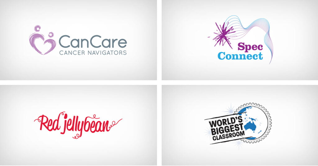
There are several types of fonts that designers consider, each conveying a different personality. Here are the main categories:
Serif Fonts: These fonts have small decorative lines or strokes at the end of characters. They often appear traditional, reliable and professional.
Sans-serif Fonts: Sans-serif fonts lack these decorative strokes. They are clean, modern, and straightforward, making them a popular choice for tech companies and startups.
Script Fonts: Script fonts mimic cursive handwriting and often evoke feelings of elegance, creativity and personal touch.
Display Fonts: These fonts are highly decorative and are best used for special occasions or specific design purposes. They are not suitable for long paragraphs but can add a unique flair to logos.


- Legibility is Key
No matter how aesthetically pleasing a font is, it’s essential that it’s easy to read. A complicated or overly stylised font might look beautiful, but if people can’t read it at a glance, it defeats the purpose of a logo. Legibility is particularly crucial if your logo will be used in various sizes and contexts.
- Custom Fonts vs. Standard Fonts
Some brands opt for custom-designed fonts, which are unique to their identity. While custom fonts offer exclusivity, they can be costly to create. Standard fonts, on the other hand, are readily available and can be a good choice if you find one that aligns perfectly with your brand. Many successful logos have been created using standard fonts with slight modifications to make them unique.

- Consider Scalability
Your logo will appear in various sizes, from business cards to billboards. A font that scales well ensures that your logo remains recognisable and readable, regardless of its size. Avoid overly intricate details in smaller sizes, as they may become lost or indistinguishable.
- Testing and Feedback
Once your designer has selected a font or a combination of fonts, test them in different environments. Ask for feedback from colleagues, friends and/or other professionals. Honest feedback can help you provide valuable information for your designer to make necessary refinements.

Conclusion
In the world of logo design, every detail matters. The font your designer chooses is a reflection of your brand’s identity and can influence how people perceive your business. By understanding your brand, exploring different font types, ensuring legibility, considering scalability, and seeking feedback, designers can make an informed decision about the best font to use for your logo. Remember, a well-chosen font is not just a design element; it’s a powerful communicator of your brand’s essence and values. To find out more about how Fresco can help you design the perfect logo for your brand click here.
