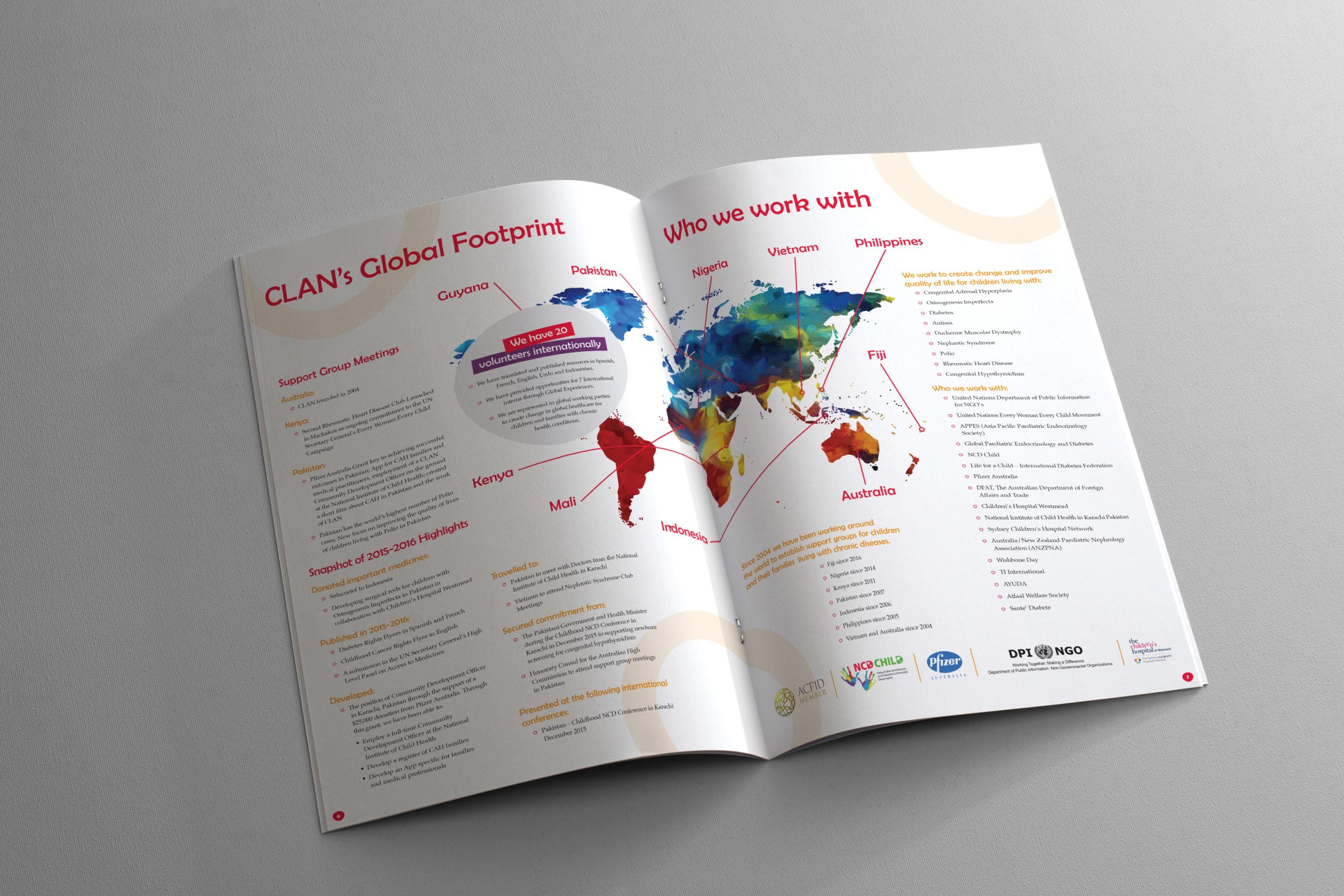
The design of any report is always important, even more so if the content is dry. Approaching a report from a design perspective is an amazing way to make your company stand out and be remembered, especially if that report is being printed. Reports in print are becoming a rare occurrence, so it’s important to view it as more of a marketing opportunity than a statutory obligation. Something people can hold on to, walk past and flick through from time to time, that has your branding all over it.
7 Top Tips
Visuals Trump Text Every time:Any opportunity to transform text into a visual, take it. Aim for at least 50/50 split between text and visuals, however majority visuals is desired.
Brand It: For a clear, cohesive look and feel your branding should be evident across the entire report, it should be subtle yet consistent.
Personality Matters:Bring the brand’s personality into play if it has one. Any established brand should have an identifiable voice that must be evident in everything from a 5-word social media caption to a 5000-word financial report. A company that can turn an otherwise boring subject into an enjoyable read is going to be remembered.


Whitespace: Allowing for a balanced, complete and visually appealing report, whitespace makes a long report far easier to digest.
Theme: Stick to one, clearly identifiable theme that is relevant to the report, your brand and its purpose. A well implemented theme should act as a guide from start to finish.
Categorise: Break it down, categories are important, particularly because not everyone needs to, or even wants to read the whole report. Make it clear to everyone what goes where.
Colour: A great tool for grouping related information and giving life to a page, every report should have one overarching colour that has clear links to the brand.
If you’re looking for help designing your next report, big or small, give Fresco Creative a call on (02) 8116 9033 and let’s see how we can help raise your brands awareness in the marketplace.
