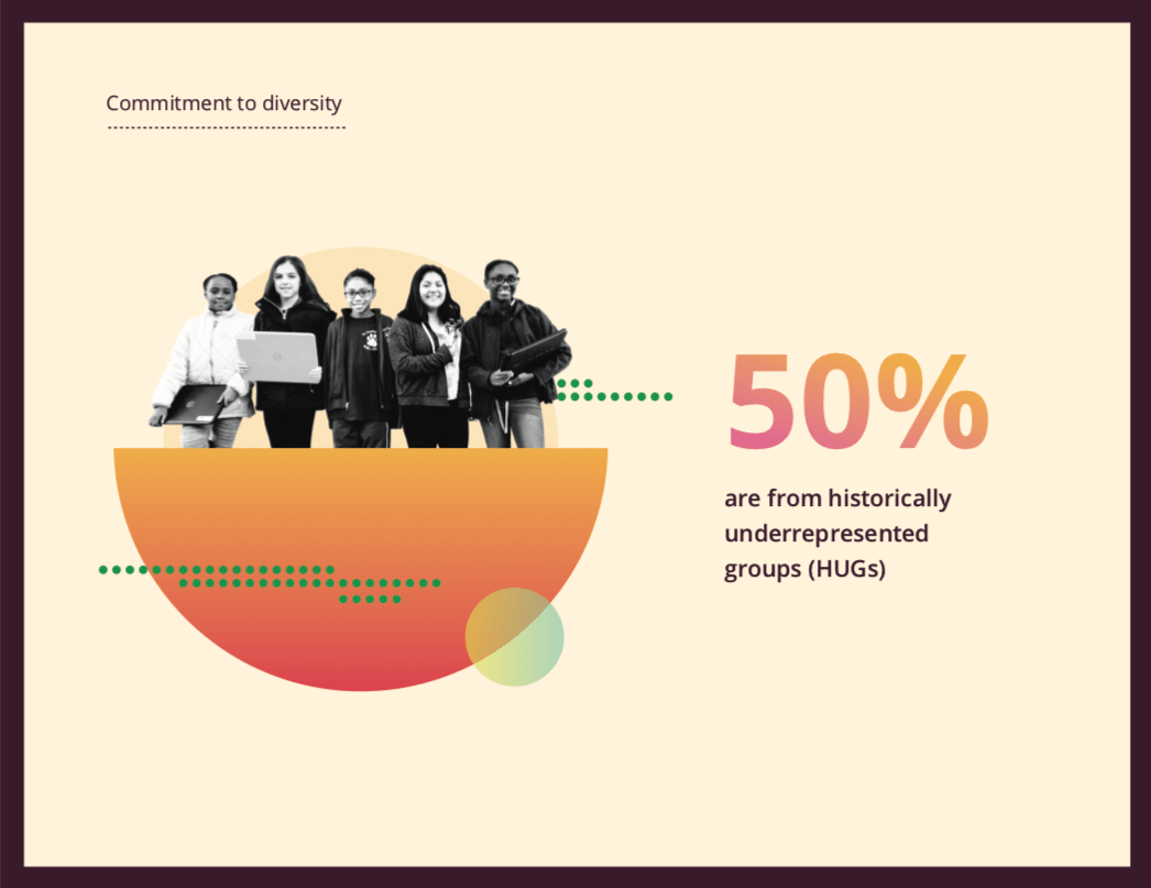
When it comes to designing for our clients, trends don’t play an important role as does understanding client objectives and creating strategic design to maximise the power and reach of the company messaging. In saying that, part of creating engaging and strategic design is creating material that has an impact and the power of cut through. It’s also no surprise that the consumer or customer as a whole gravitates and stops to take notice of the new and “on trend” so it’s important to understand what is changing in the industry and keep on the front edge of this change. As we are nearing December and the end of this decade (eeek!) I thought for this article we can take a look at what’s new and exciting in 2020 with my top 3 predictions in design and marketing.
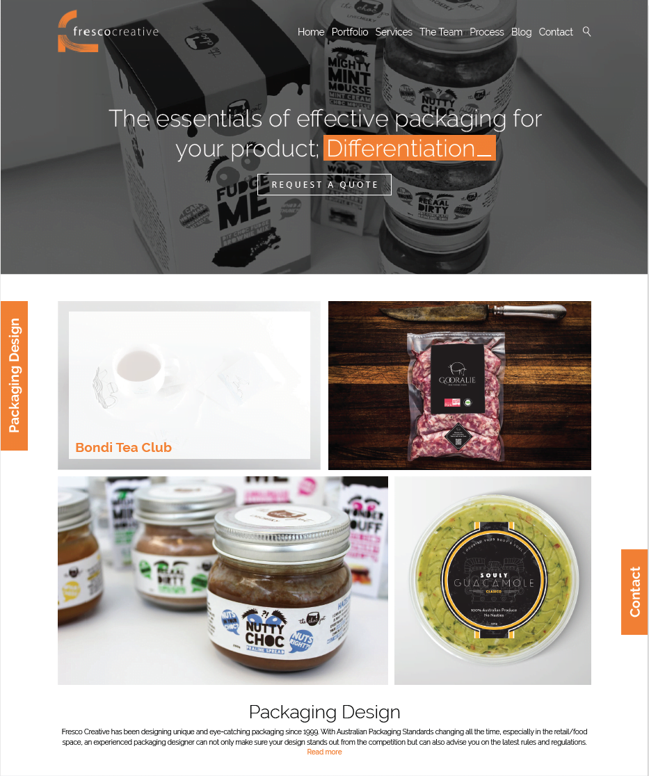
1.Dynamic Digital Design – Employing animation and sharp dynamic digital design has been around the past few years, so it’s not exactly new but it is a continuing trend that designers need to be aware of if they don’t want to be left behind. This interactivity isn’t being restricted to just web design and E-Blasts, but increasingly reporting documents that have been traditionally print only (or if a digital version was available completely static as a flattened PDF) are employing devices to make them far more engaging to the user. Interactivity, snappy dynamic features, animated icons, and brand assets are all devices that grab the user’s attention and promote their engagement so employing them can give you a real edge with design. Flat, static transitioning between pages is so last year and we are seeing a lot more interactivity to prompt the user to explore the site and maintain interest. Apparently, users have a 7-second attention span, so it pays to keep things interesting.
2. Colour Explosion – There is no doubt colour has always been one of the most powerful devices in design and marketing to grab the user and/or consumer attention, but recently there has been a real shift from the white paired back design of mega global brands like Apple towards using strong, bright colour to the full. Never one to sit on their laurels Apple has also recognised this shift in design trends and is adapting their brand and marketing to reflects this trend (see example). There is one exception and contradiction to this trend and that is the continual use of a black colour pallet with very minimal and limited pops of muted colour. This minimal use of colour means that the messaging can be sharp and strong with no other elements fighting for attention, it also allows for the marketing material to stand out with a point of difference from the explosion of colour we are seeing.

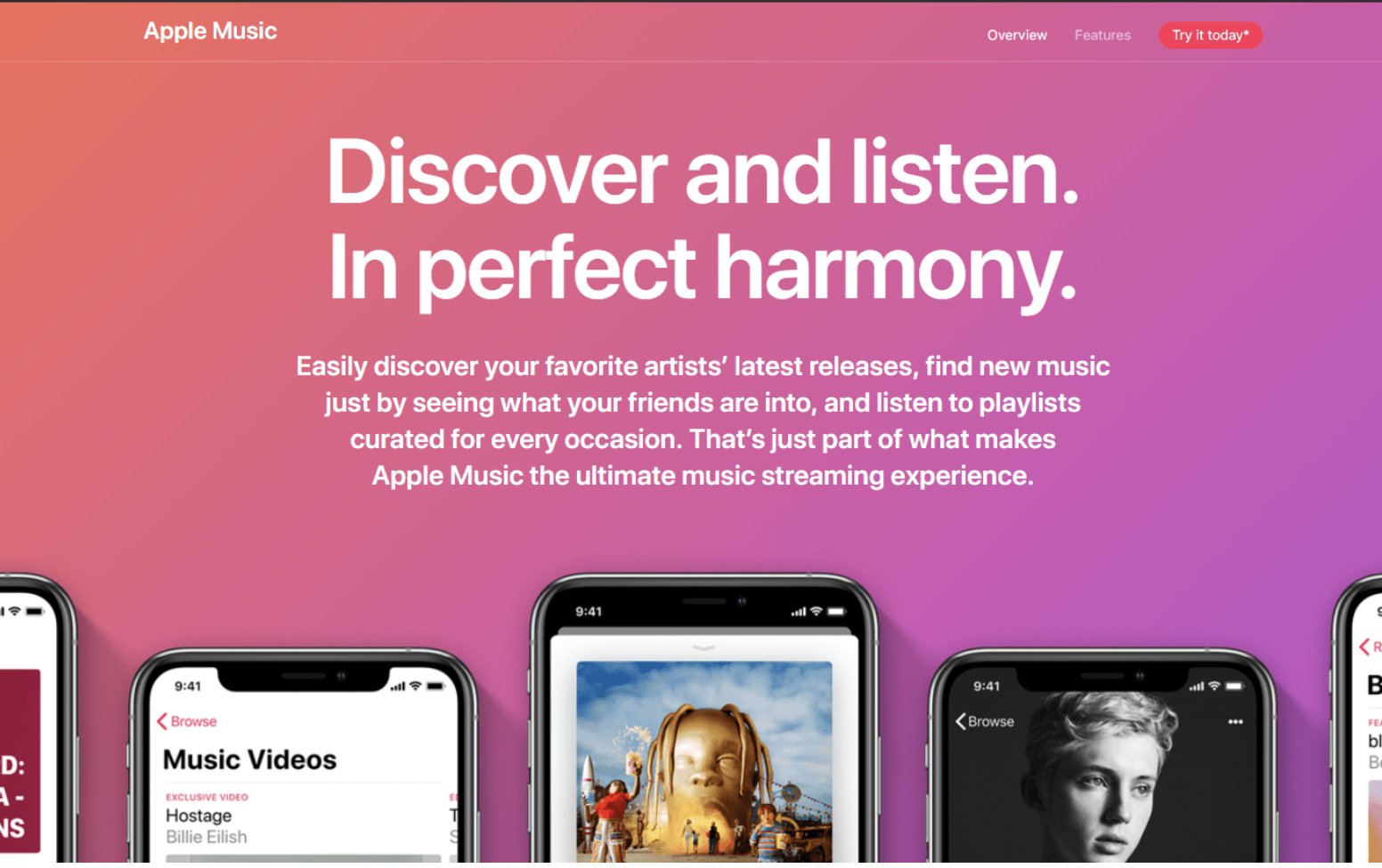

3. Gradients and Duotones – As with all good trends, this one is a revival from the 1990’s, for those who have been in this industry for a while (I’m showing my age now) duotones were all the rage and gradients very cutting edge. This technique went underground for a decade or so but has made a reappearance, after all, it’s the perfect way to showcase a range of bright colour. This technique has been repackaged under the terminology of “colour transitions” just to keep it contemporary. For 2020 these colour transitions have become far more complex and creative with designers experimenting with new ways to incorporate this technique to ensure maximin visual impact and cut through.
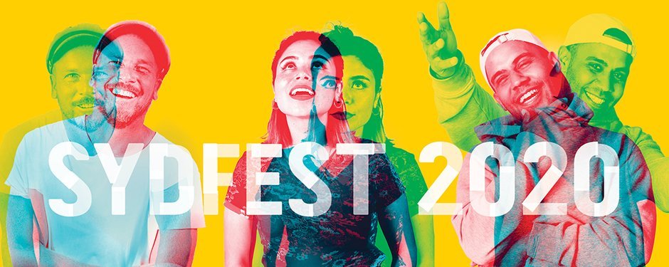

So there you have it, my predictions for the coming year and our next decade! This industry has always been about exploration, breaking the rules and experimenting with new techniques and devices, that’s one of the things I love most about it. This exploration is encouraged and welcomed in our studio because ultimately this will create a better and stronger design piece. Without a doubt, in the new year we will be seeing exciting design innovations to keep things moving forward. We can’t wait to see what 2020 brings!
