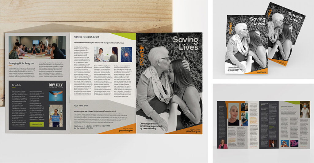

A brochure design stands out when it effectively captures attention and conveys the intended message in a clear, engaging, and memorable way. Here are some key elements that contribute to a standout brochure design:
1. Compelling visuals
High-Quality Images: Use high-resolution images that are relevant and appealing.
Illustrations and Icons: Custom illustrations or icons can add a unique touch and aid in visual storytelling.
Colour Scheme: A well-chosen colour palette that aligns with the brand identity and elicits the desired emotional response.
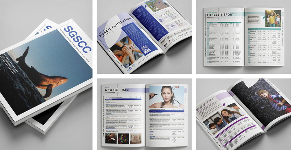

2. Clear and concise messaging
Strong Headlines: Catchy and informative headlines that grab attention and summarise the content.
Concise Text: Keep the text brief and to the point, focusing on key messages and benefits.
Call to Action: Clear and compelling calls to action that guide the reader on what to do next.
3. Thoughtful layout and design
Balance and Alignment: A balanced layout with proper alignment ensures the brochure is visually pleasing and easy to read.
White Space: Adequate white space prevents the design from feeling cluttered and makes it more readable.
Typography: Use readable fonts and maintain consistency in typography throughout the brochure.
4. Unique fold and format
Creative Folds: Unique folding techniques (like gatefolds, z-folds, or tri-folds) can make the brochure more interactive and engaging.
Unconventional Sizes: Non-standard sizes can make the brochure stand out from typical brochures.
5. Brand consistency
Brand Colours and Fonts: Use colours, fonts, and design elements that are consistent with the brand’s identity.
Logo Placement: Ensure the logo is prominently and tastefully placed.
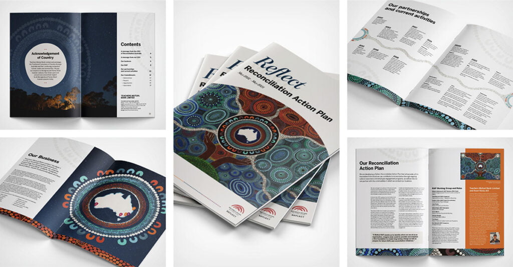

6. Engaging content
Storytelling: Use a narrative approach to make the content more engaging and relatable.
Testimonials and Case Studies: Real-life examples and testimonials can build credibility and interest.
7. Tactile and finishing touches
Paper Quality: High-quality paper stock can enhance the feel and perceived value of the brochure.
Special Finishes: Techniques like embossing, foil stamping, and spot UV coating can add a premium touch.
8. Functionality and practicality
Information Hierarchy: Present information in a logical order with clear headings and subheadings.
Contact Information: Make sure contact details are easy to find and include multiple ways to get in touch.
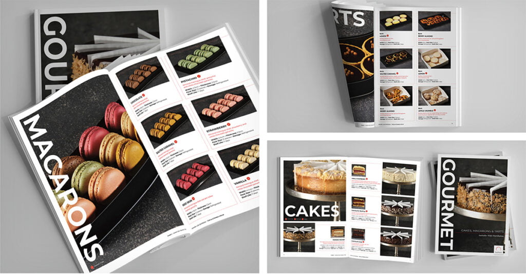

9. Interactive elements
QR Codes and Augmented Reality: Integrating digital elements like QR codes or AR can provide additional content and interactive experiences.
Perforations and Inserts: Elements like tear-off coupons or inserts can add functionality and engagement.
10. Target audience focus
Audience Relevance: Tailor the design and content to resonate with the specific target audience.
Personalisation: Personal touches, such as addressing the reader by name, can increase engagement.
A combination of these elements, tailored to the specific goals and audience of the brochure, will help create a design that not only stands out but also effectively communicates the intended message. To see how Fresco can help with your next brochure design click here!
