In an era where we are being told that content is king, we are often tempted to include every bit of information we have researched into our reports. However, have you ever spoken to any of the end-users who read the content? Perhaps we should measure how much of our content is read and how easily.
Designing reports that are as beautiful as they are functional is the key if you want people to read the content. Keeping your reader engaged is the overall objective.
Here are 10 easy ways to keep your readers engaged.
- Text with visuals for a balanced and more engaging report.
As humans, we’re much better at understanding information presented in the form of visuals rather than as written text. When designing a text-heavy report, it is essential to look for opportunities to transform the text into visuals. In doing this, you are creating a report which is more likely to be read by the audience the report is intended for.
Where possible aim for at least a 50/50 balance between text and images. Dedicating at least half a spread to visuals like charts, diagrams, infographics, and meaningful photographs.
If your report does require a more text-heavy approach, it is beneficial to try to scatter something visual between the long paragraphs of text. We love using pull out text as a break from the density of a text document. Alternating text with visuals will help keep your readers engaged from page to page.
Just remember, functionality should always come first.
Visuals should be used to enhance understanding–to categorize, highlight, and emphasize information–not just to break up the text. Choose visuals that make your content easier to understand.
- Help significant information stand out using a single bold colour.
Colour can be one of the most engaging elements of any design.
Colour can be used to control where our readers look, therefore assisting with the navigation and guiding the reader through the document. Bold colour accents draw your readers’ attention to any key facts and figures that are particularly important.
Colour is a powerful tool for highlighting significant data points and drawing attention to report headers.
In saying this, don’t go crazy, be smart with your colour choice and its application. Using too many bright, contrasting colours will have a negative effect where you risk overwhelming the senses of your audience; therefore, creating a distraction.
Sticking with a single colour that compliments your brand will increase engagement and assist in creating cohesion across all design elements.
- For an easy-to-navigate report, create a hierarchy with text.
In the same way, we use colour to tell our readers what to look at first.
We can use text size and type to say to our readers what to read first.
This is what a typographic hierarchy is all about–sizing and styling text so that readers can easily navigate your reports with ease.
In an ideal world, your report should have at least three levels of text hierarchy. This hierarchy should be applied to the entire document and remain consistent throughout and be in line with your company brand assets. At the very least, there should be different styles for:
- Header text
- Sub header text
- Paragraph text
Headers should be big and bold enough to grab your reader’s attention. Sub headers should be a little smaller, and a little less stylized. This is great to use as pull-out vital information that you want your reader to read if nothing else on the page. Paragraph text should be more minimal in style, and preferably a font that is easy to read.
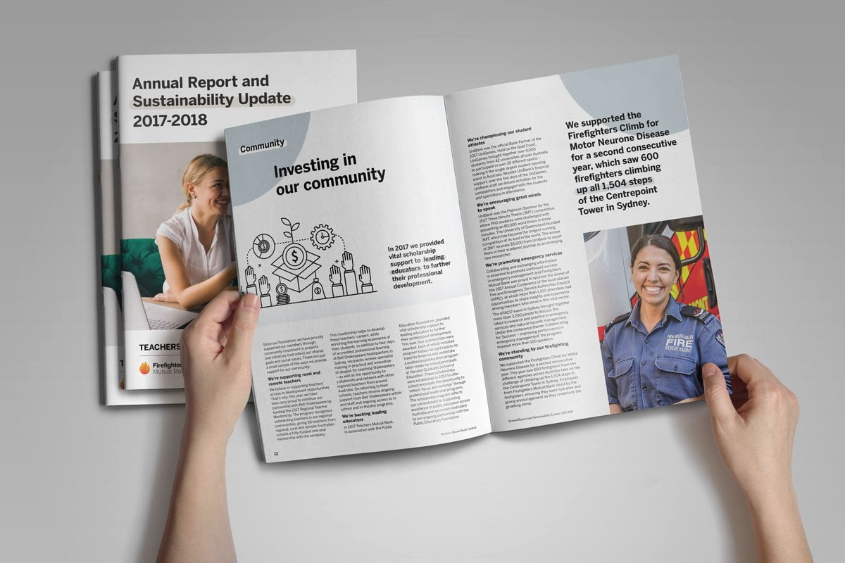

- Use of your brand is key to reinforcing your presence in the business community.
Your company’s brand says a lot about who you are, what you stand for and fundamentally an insight into your company’s core values.
Using your companies brand elements will enable a consistent, clear message throughout the design of your report. This is critical in creating a report design that feels like one cohesive document.
That being said, you can still push the brand’s boundaries; you still want to create an aesthetically pleasing document. It is because of this that we believe working with an agency is vital; a qualified graphic designer will know exactly how to push the creative boundaries without compromising your brand and its integrity.
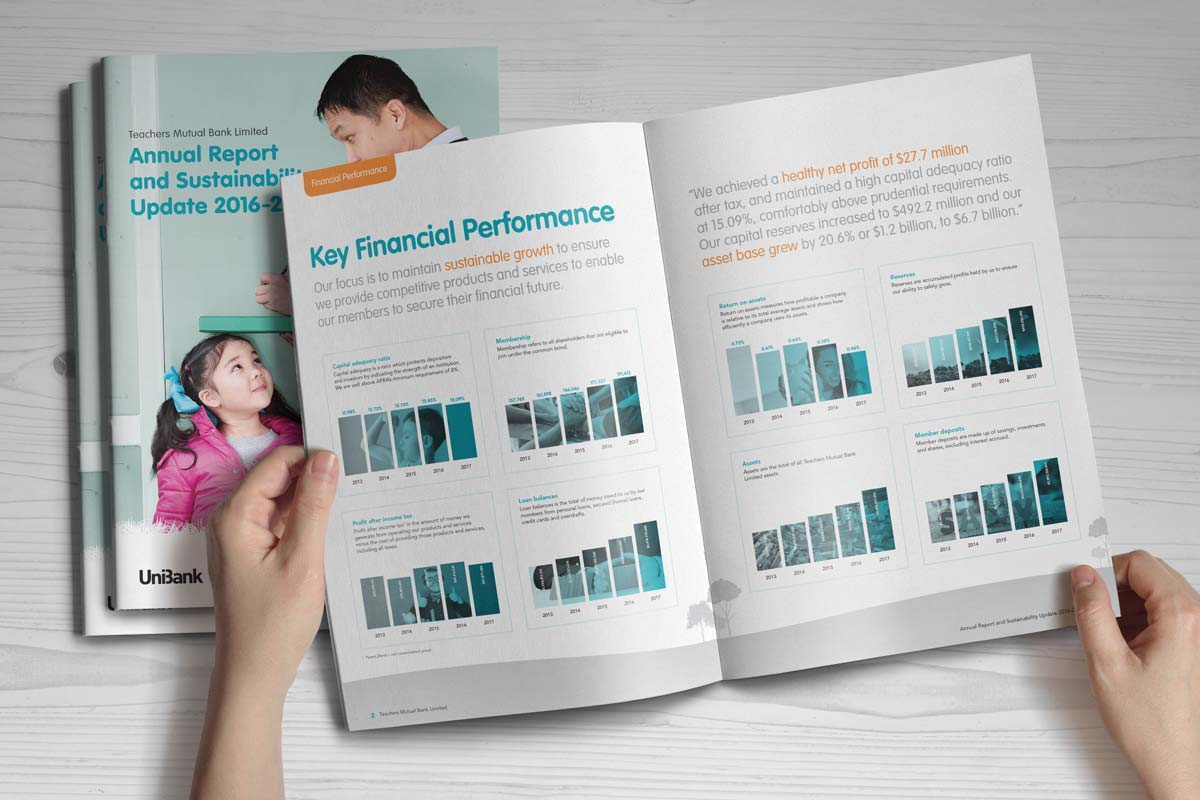
- Bar graphs, line charts and pie charts will make your data stand out
Data visualization in a lengthy report does not need to be fancy.
In fact, the simpler the better!
Using more straightforward graphs such as line charts, bar graphs, bubble charts, means that you won’t run the risk of confusing your readers. They can make the data pop!
These basic charts and graphs can even be quite engaging when incorporated cleverly into your overall design.
What to use when is also important. Line charts are useful to use when wanting to highlight trends over a period of time. Bar charts work well when demonstrating the difference among categories. The best way to highlight key performance indicators or stats is by using a large number of charts or graphs or simple infographics.
It is essential always to create context for the reader that provides clarification and explanation.

6. The Grid, why it is essential to help with legibility.
A grid in your design helps your reader predict where elements and information will be. Grids are tools for organizing space, text, images, and any other aspect placed in a design. Grids add structure to a design.
A disorganized report not only looks unprofessional; it is difficult to read and navigate through. You don’t want to risk losing the attention of your reader.
Keep your reports organized by building them to a grid. There are many grid systems to choose from.
The optimal line length of readability is about 60-70 characters per line. Keep this in mind. Generally running text along a single line across a page inhibits the readers’ ability to absorb the information.
- Whitespace in your report design is a good thing.
Whitespace, the empty space around every piece of content on a page, is an essential element of good design. Sometimes it is referred to as negative space. For publication reports designers, white space is significant. Whitespace, as the name would suggest, doesn’t just have to be white. It can be of any colour, texture, pattern or large full-page image.
The perfect amount of whitespace makes a design feel balanced, while a lack of whitespace makes a design feel cramped and unfinished.
As per studies, the average attention span of a reader is 6 seconds, which is even less than of a goldfish. Effective use of white space helps the design get the message through the user quicker and therefore increases the probability of interaction.
Leaving generous margins around text sections, creating space for the reader to digest information and charts can prevent the reader from getting overwhelmed and in turn disengaged with your report.
- Create design cohesion across every page of your report design
Consistency is crucial to excellent report design. If you are not fortunate enough to be a designer, it’s easy to stray your brand away from its core identity. It’s vital that when you are working on your brand, to stay on brand. Each page of the report is unique in its layout and requirements. It is a great idea to create a cohesive feel across your report. Introduce a couple of design assets that remain consistent from page to page.
These consistent design elements could be anything, images, illustrations, icons, colour or even just shapes!
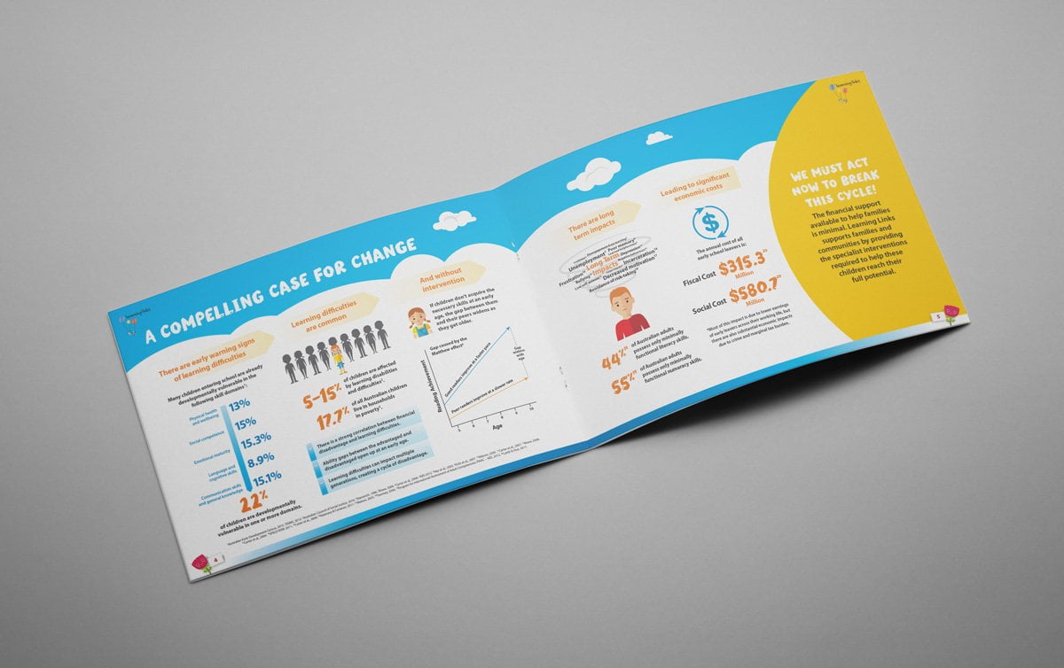
- Use colour blocks to group related information
The layout and design of a report should help your readers navigate their way through the report and easily access information from within the report. Colour blocks have the ability to create a striking impact and vibrant energy. Did you know that colour blocking arose during the modernist art movement of the 20th century?
Essential design elements such as blocks of colour, lines, and borders indicate which information belongs together, therefore, making it easier for readers to interpret that information quickly.
Data-heavy pages can quickly get visually overwhelming, with a tonne of data points, lines, and bars all competing for our attention. By dividing these pages into defined sections, we can create a system within the report design that’s much easier to digest.
Don’t underestimate its power.

- Detailed tables and graphs to highlight the data.
To avoid overwhelming readers, detailed charts and figures, we don’t suggest make up the main body of the report. It is wise to include them as part of an appendix.
This allows interested readers to explore your content in greater depth while keeping your core report short and sweet.
When creating tables a few design tips worth considering.
- Use a bright colour to distinguish header rows from body rows clearly.
- Alternate the colour of body rows between white and light grey to make the table easy to scan.
- Use brightly coloured boxes to draw attention to critical values in the table.
Designing an effective report is all about including the right amount of information; it is about getting the balance right. Your goal is to highlight the key takeaways and back up those statements with supporting visuals. Any information other than this might be worth considering including as part of a chart.
By being smart and strategic in the way you display information can lighten a substantial report and turn it into something which is accessible, engaging and dare I say an absolute joy to read.
After reading this article if you need help engaging your readers and designing a report that has a good chance of being read. Please contact Fresco Creative to learn how we could possibly assist you in designing your next annual report.
