
Did you know that if you google search how many fonts are in existence there are varying answers with some reports claiming over 200,000 different types?
With potentially so many options how do you choose the most appropriate typography for your visual storytelling?
Typography plays a key role in setting the tone of messaging, and although it may be thought of as a subtle element by some, it exerts significant influence!
Guaranteed high performance in visual storytelling can rest on the selection of appropriate typography. Wrong choices can derail intended meanings interfering with or muddying the water for targeted messaging to specific audiences.
The following simple example demonstrates how style attributes of fonts exert influence over meaning in visual storytelling.
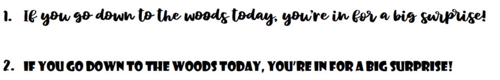
The first sentence using the font style mystical woods rough script gives off a playful vibe as if there would be something fun happening. The font style showcard gothic used for the second sentence creates a more authoritative tone creating a darker mood suggesting something more sinister.
Typography in visual storytelling influences our actions!
An important aspect of visual storytelling is finding a stand in for ‘tone of voice’ and ‘facial cues’ that would normally be present in face-to-face interactions. Typography can be used to create cues for evoking certain emotions and influencing mood.
According to the Washington Post, in What’s your type? by Emma Kumer, Geoffery Fowler and Leslie Shapiro, different typography embodies different styles, emotion and authority. They say that fonts are like costumes, like a villain’s costume in a movie for example, and this is how “added parts to a story can be quietly communicated in visual storytelling”. The article includes a quote attributed to 20th-century editor Beatrice Warde that fonts are “the clothes that words wear”.
Within each different font style variations impact how words are perceived. Considering these common characteristics is useful when thinking about typography in visual storytelling.
Proportion
Letters are harder to read if they resemble each other too much. An example of this is when letters are very condensed.
Contrast
In the context of typography contrast describes the difference between the thickest and thinnest part of each letter within a font style. Research shows that if the style of the font makes the contrast too high then other parts of the letter may fade into the background causing eye strain.
Letter spacing
Getting the letter spacing right is crucial. Crowding too many letters into the visual space has an adverse effect on the ability of readers to interpret meaning and messaging.
X-height
Each font design has a specific height between the lowercase version of letters compared to the capital version. This can either make words easier or harder to read. Researchers studying readability of drug labels for example found that the X-height was more important as a factor for readability than overall type size!
If you want to create an amazing design that will outperform in the vast arena of visual storytelling, are interested in using typography to the best of your advantage, and looking to engage with an experienced Sydney-based graphic design agency, then contact us at Fresco Creative.