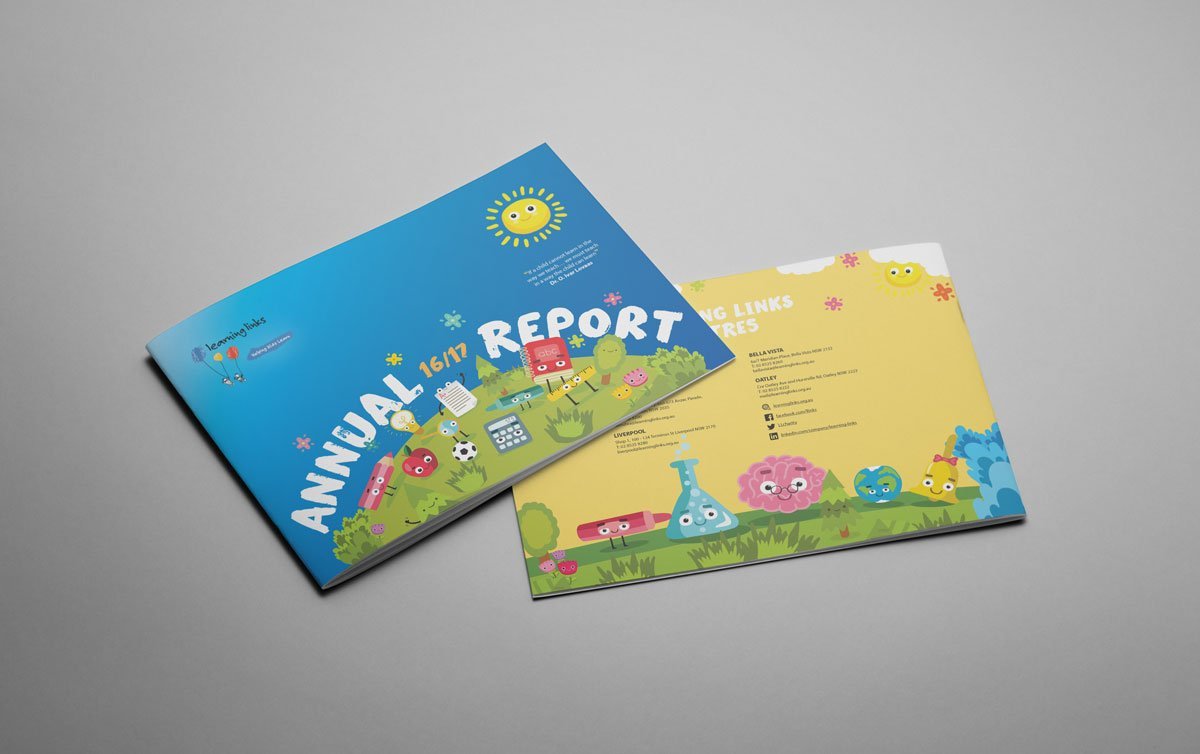
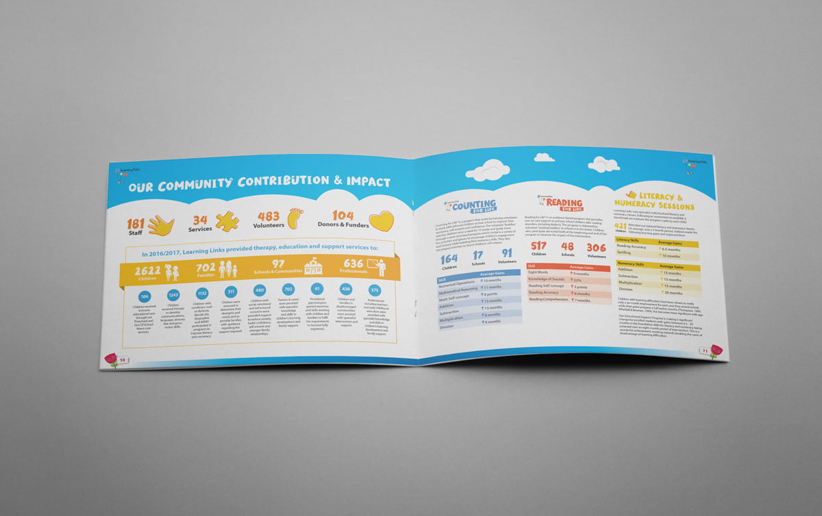
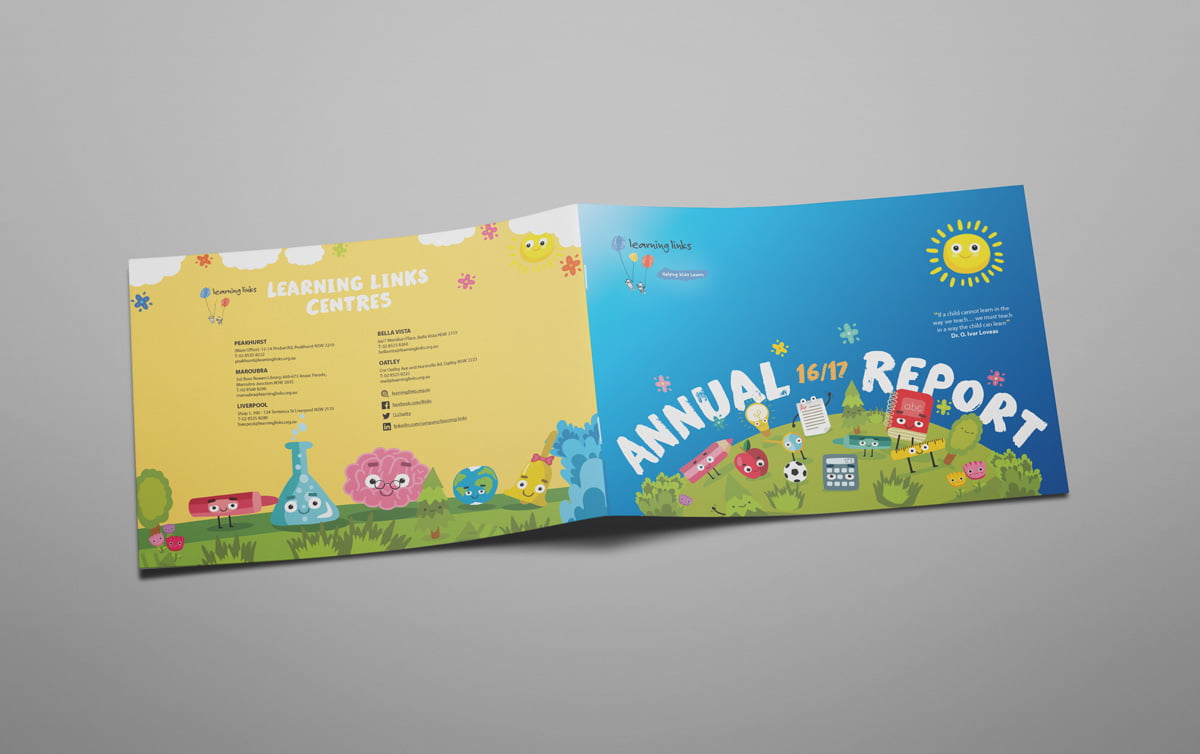
Learning Links approached Fresco Creative to evolve their annual report design. Their mission is to help children who are falling behind due to learning difficulties such as ADHD, Dyslexia, high functioning autism, speech and language disorders as well as mental health issues including anxiety. With fresh eyes we were able to capitalise on the bright and happy nature of their brand and highlight those features with the use of well thought out illustrations and informative infographics. The key themes of the openness, freedom, clear skies and looking towards the future in a positive way, were heroed in this concept.
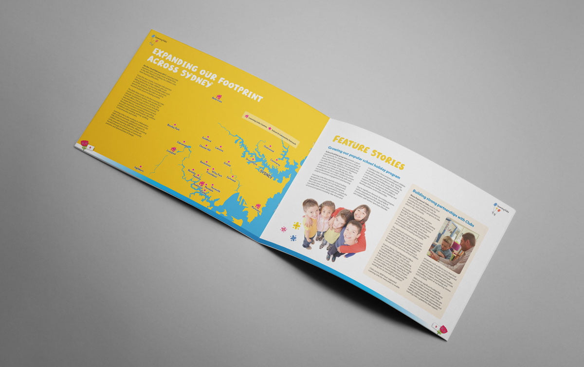
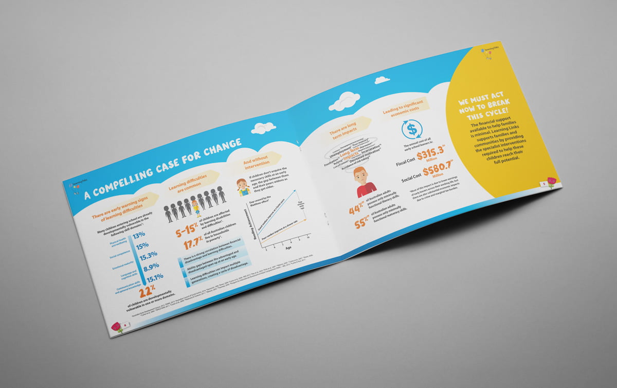
The illustrative style aligned with their target audience and helped elevate some of the ‘drier’ sections of the annual report, like maps and financial details. This concept was a substantial evolution of the previous years reports – it looked in-keeping with them but well refreshed. The gradient’s sky-like appearance integrated well with the world of educational characters presented. The illustrated characters represented various aspects of the learning process and were be re-used across supporting collateral (outside the Annual Report) and infographics.
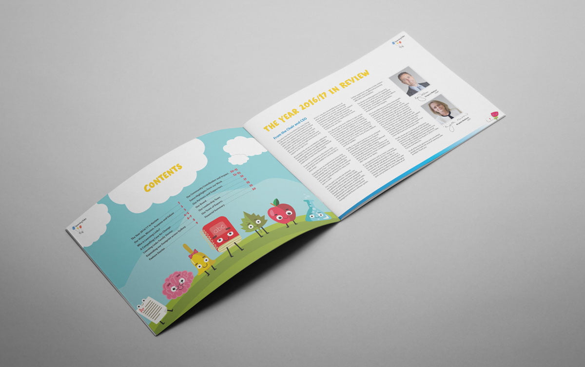
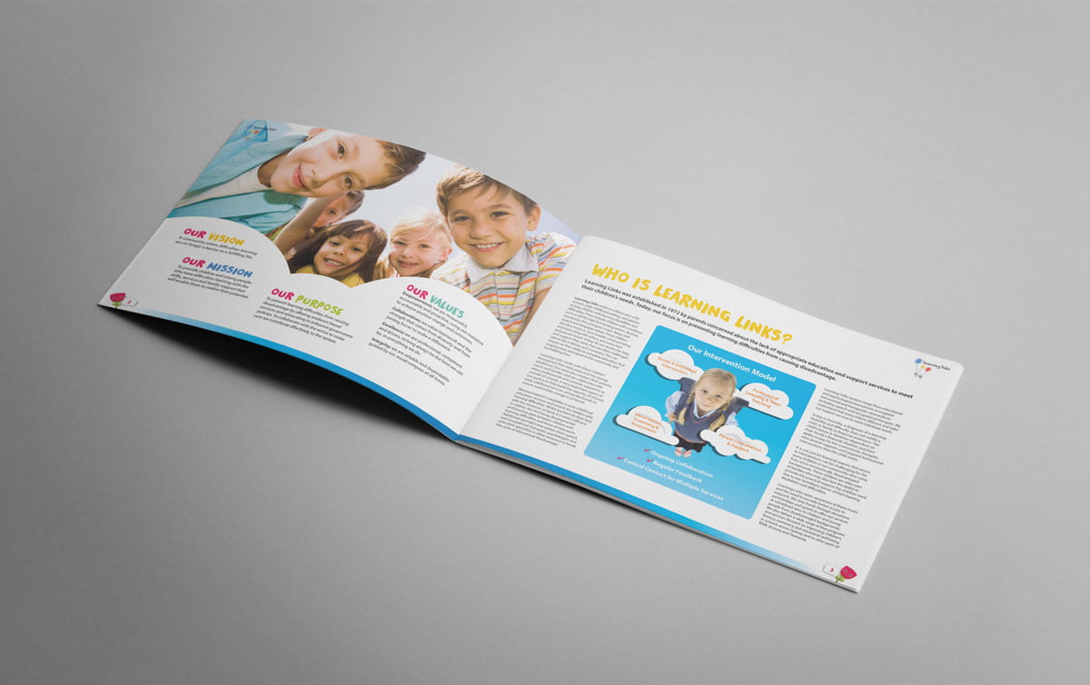
The editorial was designed in a way that carried on the sky-like theme from the cover by placing the content in a cloud-like shapes. This type of arrangement worked well with the full sized background images and was helpful in filling up pages with little text. One of the illustrated characters from the cover was used for the page numbering, helping to tie the overall concept together. We selected fonts based on legibility and their relationship to the overarching branding.
“We really love this! The colours are great and it has such a fun vibe that it makes us feel happy, which is perfect.” – Nyree Voysey, Marketing and Fundraising Specialist, Learning Links
