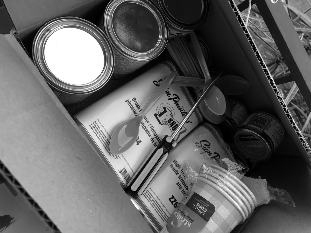
After writing a blog about the book Signs of Australia, and watching the movie Sign Painters, Fresco’s own graphic designer Andrea, decided to give it a go! She sourced some nice Mack pin-striping brushes, 1Shot Sign Painters’ paint and other bits and bobs like brush cleaner and paint thinner.
Graphic design plays an important role in sign painting as you need to carefully plot out your sign. If you start at the left edge without a care in the world, you will likely run out of room or have typography that is not centred.
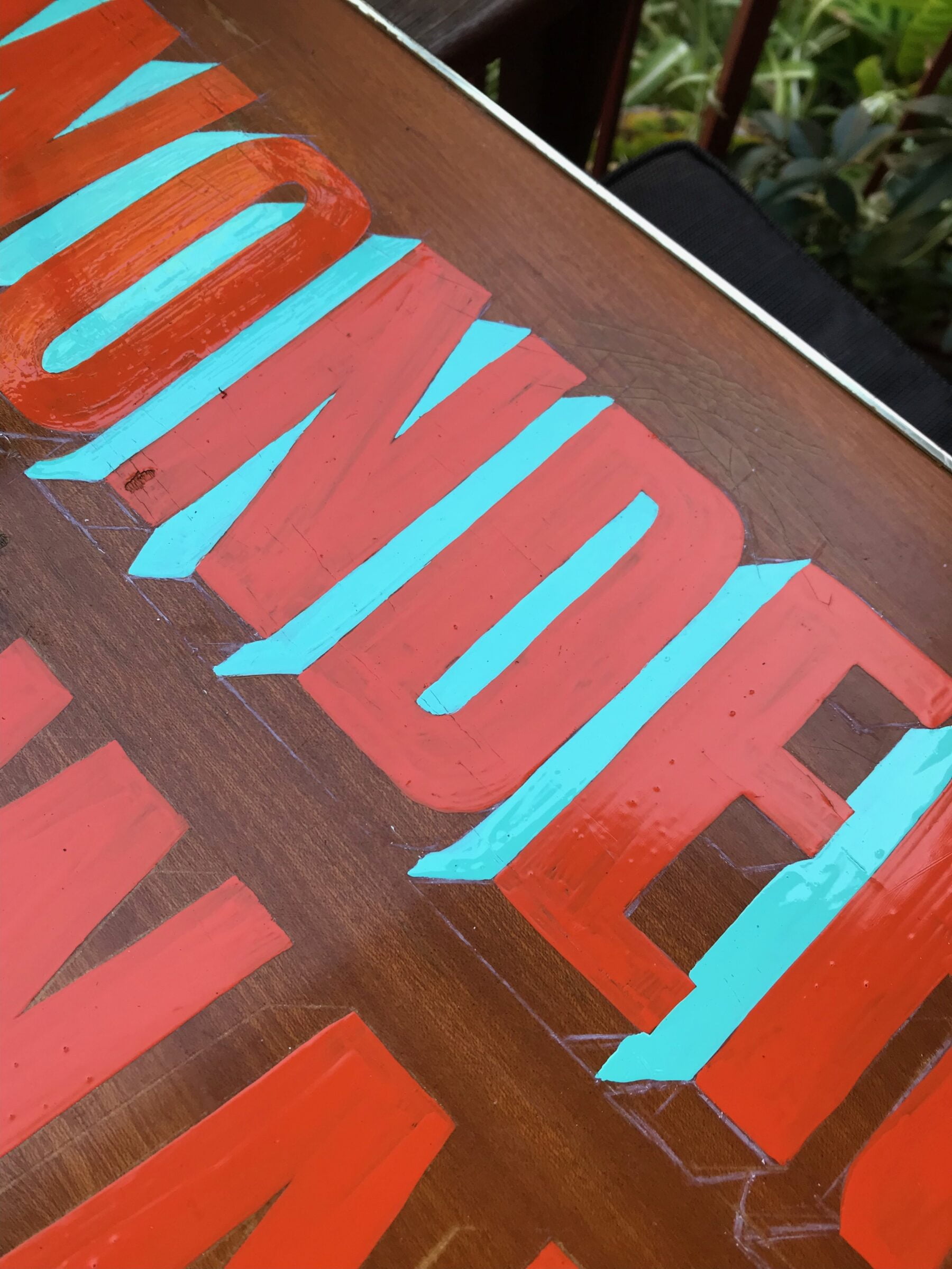
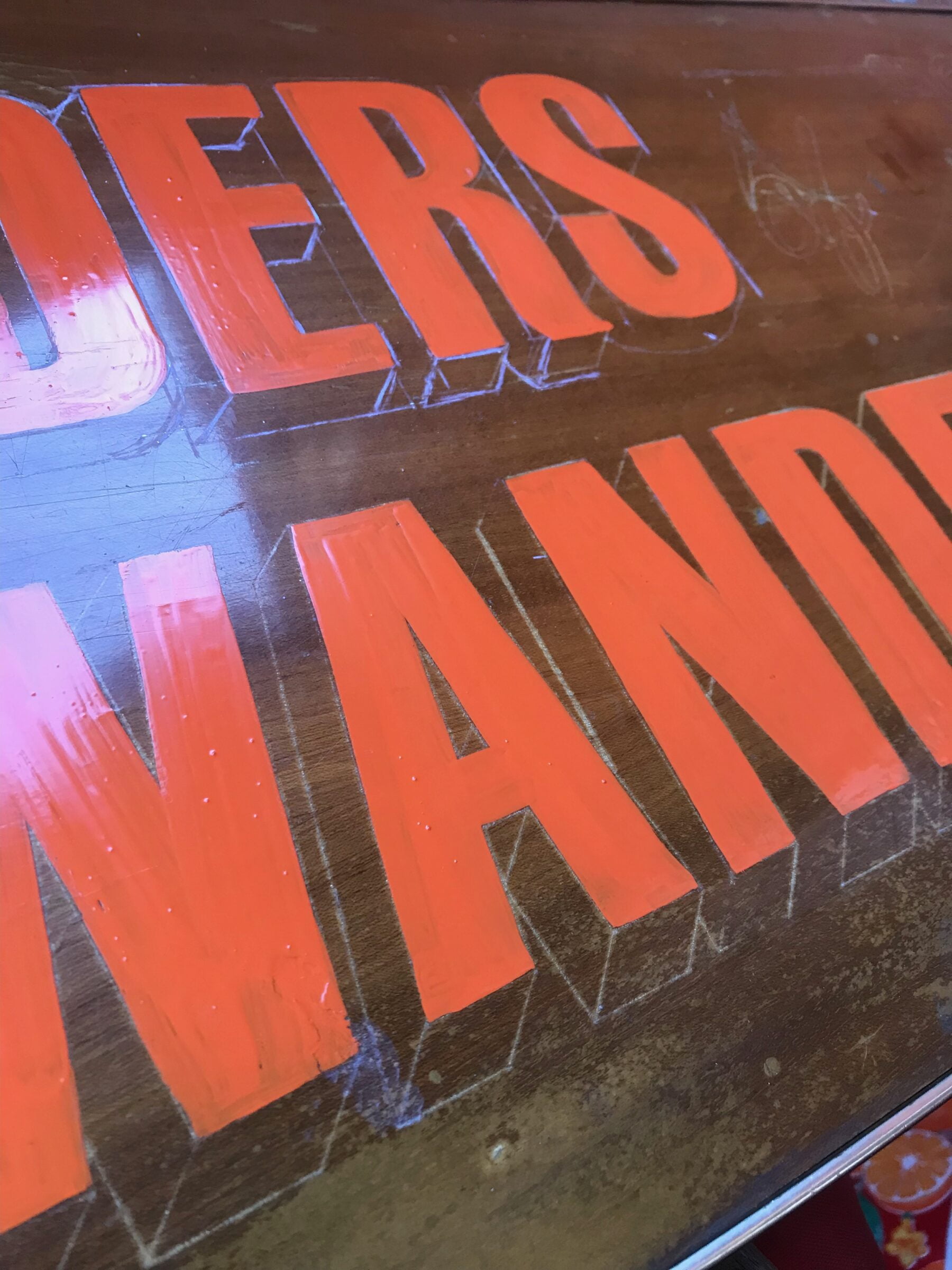
Andrea used tracing paper, a white pencil and a printed template of the phrase “Wonders of the wanderer” for her first sign. She chose two fonts that contrasted well together and typographic styling for “wonders” and “wanderer” that suited 3D shadowing.
Sign painting enamels are notoriously toxic so it’s important to avoid closed-in locations with limited ventilation. Andrea is no fool, so she’s always careful to use a painters face mask and works outside.
“I found the process quite meditative once I got going. I had a bit of trouble getting the brush to make a neat 90 degree corner at the top of the letters but soon found that if I placed the brush down a bit lower than the top and then moved it up slightly, the brush would fan out into a straighter line – so that worked better. I did realise after doing the aqua that I probably should have done that first, before the orange lettering. But there’s always a next time! ” – Andrea
