Colour psychology is a fascinating aspect of graphic design that explores how colours affect human emotions, behaviours and perceptions.
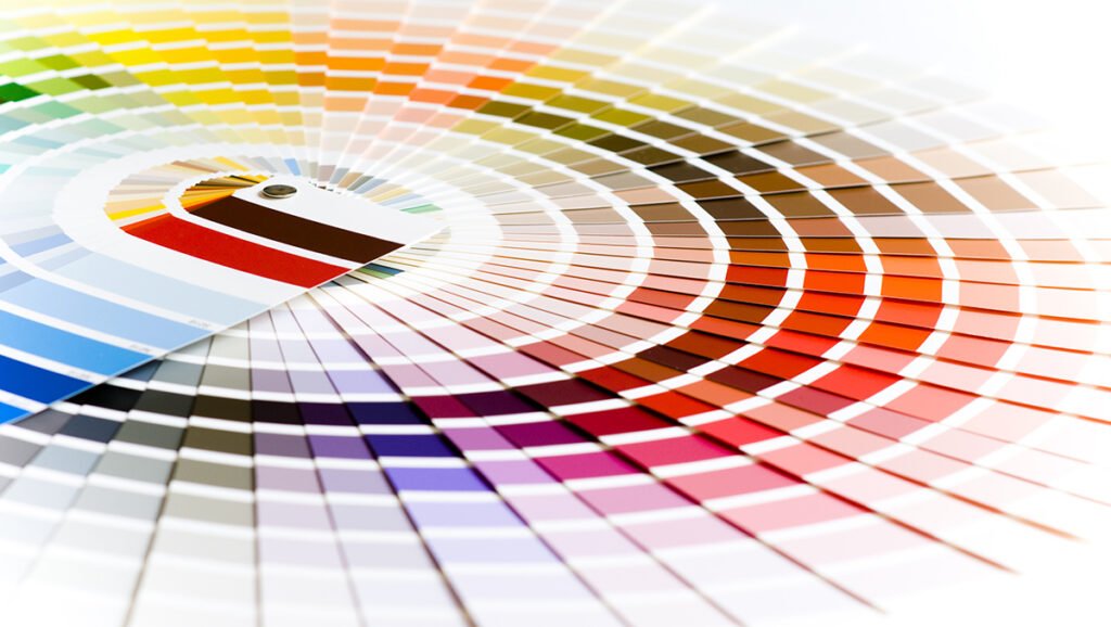

By understanding the psychological impact of different colours, graphic designers can create visually appealing and emotionally resonant designs that effectively communicate the intended message. Here’s a breakdown of how colour psychology influences graphic design:
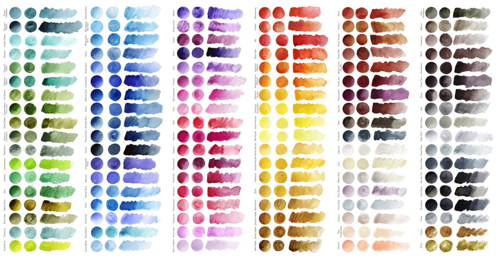

Red: Passion, energy, love, urgency. Often used to grab attention, evoke excitement, and create a sense of urgency. It’s commonly used in sales and clearance signs.
Blue: Trust, calm, professionalism, reliability. Frequently used in corporate designs to convey professionalism and reliability. Lighter blues can create a sense of calm, while darker blues exude a sense of security.
Yellow: Happiness, positivity, optimism, warmth. Invokes a cheerful and energetic mood. It’s often used to highlight important elements and capture attention.
Green: Nature, growth, harmony, stability. Represents environmental issues, health, and tranquility. Darker greens are associated with wealth and stability.
Orange: Creativity, enthusiasm, warmth, energy. Grabs attention, often used to create a sense of urgency or to highlight specific elements in a design.
Purple: Luxury, mystery, sophistication, spirituality. Represents creativity and imagination. Light purples are often used to create a feminine and romantic feel.
Pink: Romance, love, compassion, sweetness. Commonly associated with feminine and youthful designs. It can create a sense of innocence and romance.
Black: Elegance, power, sophistication, mystery. Often used to create a sense of luxury and sophistication. It can also be used to make other colours stand out.
White: Purity, cleanliness, simplicity, innocence. Often used as a background colour to convey simplicity and cleanliness. It’s also used in minimalist designs.
Brown: Earthiness, stability, reliability, warmth. Represents nature and organic products. Often used in designs related to food and the outdoors.
Considerations in Graphic Design
Cultural Differences: Colours can have different meanings in different cultures. It’s essential to consider the cultural context of the target audience.
Colour Combinations: The way colours interact with each other is crucial. Complementary colours (opposite on the colour wheel) create contrast, while neighbouring colours (next to each other on the colour wheel) provide harmony.
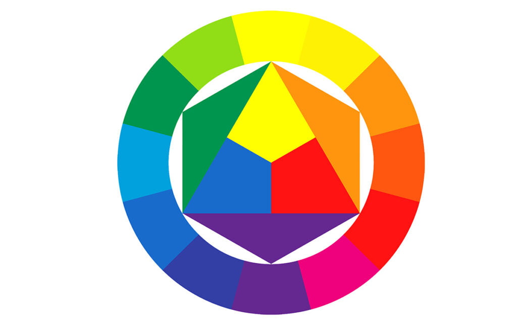

Accessibility: Ensure that the chosen colour scheme is accessible to people with visual impairments. High contrast between text and background is essential for readability.
Incorporating the principles of colour psychology in graphic design not only enhances the visual appeal but also strengthens the emotional connection between the design and the audience. Designers who understand and leverage the power of colours can create impactful and memorable visual experiences. To see how Fresco can do this for you visit us here!
