
Colour plays a key role in creative concepts. Its influence is far reaching particularly when it comes to priming an audience to receive messaging in a particular way!
As everyone knows our emotions can sometimes take over our logic, and colour does have a subtle yet powerful influence over our mood!
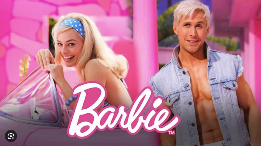
Recently released, the Barbie movie starring Margot Robbie is a solid example of how colour use in set design and graphics exerts meaning and influence over audiences.
Did you know that the Barbie movie, directed by Greta Gerwig, is being heralded as changing the meaning of the colour pink?
Industry commentary about the movie claims that the colour pink, long associated with submission and passivity, has now been reclaimed as a colour that symbolises subversiveness – a notion embraced in the new Barbie film according to writer Clare Thorp.
Graphic design artists and set designers working on the Barbie movie zeroed in on the doll’s long association with the colour pink making use of a pink-colour palette made up of one hundred different shades. Apparently, their extensive use of pink contributed to a global shortage of pink paint!
Extensive use of pink in the Barbie set designs and costumes has led to a wave of pink across multimedia advertising spaces. Described as a sea of pink left behind by the movie’s influence, it is turning up on advertising billboards, buses and even real-life Barbie Dreamhouse on Airbnb, as well as extending its reach to more than one hundred brand tie-ins.

When thinking about the power of colour in visual communication it is interesting to note how colour meanings have changed throughout history! Cultural historian, and author of The secret lives of colour, Kassia St Clair, highlights how pink has carried different associated meanings according to the prevailing cultural beliefs of the time.
For example, in western culture the notion of ‘pink is for girls and blue is for boys’ did not arise until the mid-20th century. After World War Two, as women retreated to the home and men returned to the workforce, pink came to symbolise delicateness and unthreatening in nature.
Going back further in history to the late 19th Century, the New York Times printed an article in 1893 stating that pink should always be given to boys and blue to girls, as pink was seen as stronger, more closely related to the colour red signalling passion and aggression whereas blue was more closely associated with the hue of the Virgin Mary.
If you are interested in how colour influences your audience’s interpretation of your visual communications, and would like to collaborate with experts in this area for your next project, then contact us at Fresco Creative.