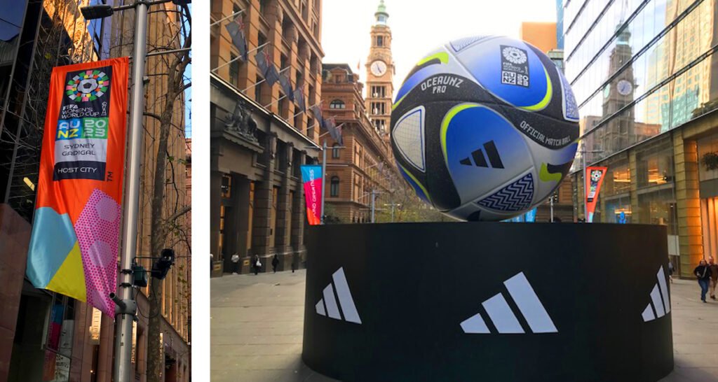
The top 8 women’s soccer teams will play for a spot in the women’s FIFA world cup semi-finals this weekend.
Australia’s Matildas are in the top eight along with Spain, The Netherlands, Sweden, France, England, Japan, and Colombia.


Being one of the largest world stages for women’s sport, the designs for the home, and away jerseys are under the spotlight! So, what are some of the meanings behind the colours and graphic designs for the uniforms of the women’s FIFA world cup teams?
Spain’s playing away jersey has been designed by Adidas and makes use of graphics that have been inspired by the coral reefs found in both Southern Europe and Australasia. The meaning behind the design is to highlight the plight of our world’s oceans and bring this to the forefront of people’s mind using the women’s soccer FIFA world cup stage! .
The Netherlands women’s world cup away jersey makes use of a modern graphic design based off the team’s lioness crest. The lioness crest is a graphic that represents the team’s power, strength, and ability on the soccer field. Vibrant shades of blue used in the away jersey are drawn from the iconic Dutch tin-glazed earthenware. The home jersey is a bright and lively orange that was originally a symbol of the Dutch royal family and has since become a symbol of sporting excellence.
Colombia’s away jersey was created by Adidas and the graphic design draws inspiration from traditional scarf patterns worn at official occasions by their national sporting teams. The glitched graphic on the jersey was created using panels from the red ball that dominates the team badge. The jersey also makes use of Climachill technology that creates an instant cooling sensation during warmer weather matches.
Australia’s Matilda’s home jersey is the distinctive yellow but their away jersey is equally well designed. The away jersey features a distinctive aqua colour which symbolises Australia’s oceans and beaches whilst the pale-yellow detail and dark blue side panel represent Australia’s other natural wonders. The modern bright colours of the away jersey did cause a stir amongst traditionalists who like to see Australia’s teams represented in the green and gold, but the Matilda’s love the away jersey and its modern design which they see as inclusive and appealing to upcoming young soccer players.
Sweden’s away jersey graphics take their inspiration from the sparkling Swedish glaciers and intend to send a message that the time to act on climate change is now! The fabric is 3D engineered and designed to be moisture absorbing as well as incorporating breathable mesh ventilation inserts. The jerseys are made using a type of yarn that comprises 50% of what is referred to as Parley Ocean Plastic which is reimagined plastic waste that has been intercepted on remote islands and beaches and from coastal communities and shorelines. According to Adidas the garments contain approximately 70% recycled content in total.


If you are keen to promote your brand using inspiring graphics, meaningful colour choices, and environmentally responsible decisions, then we are the graphic design agency to fulfill your brief! Get in touch with us at Fresco Creative.
