
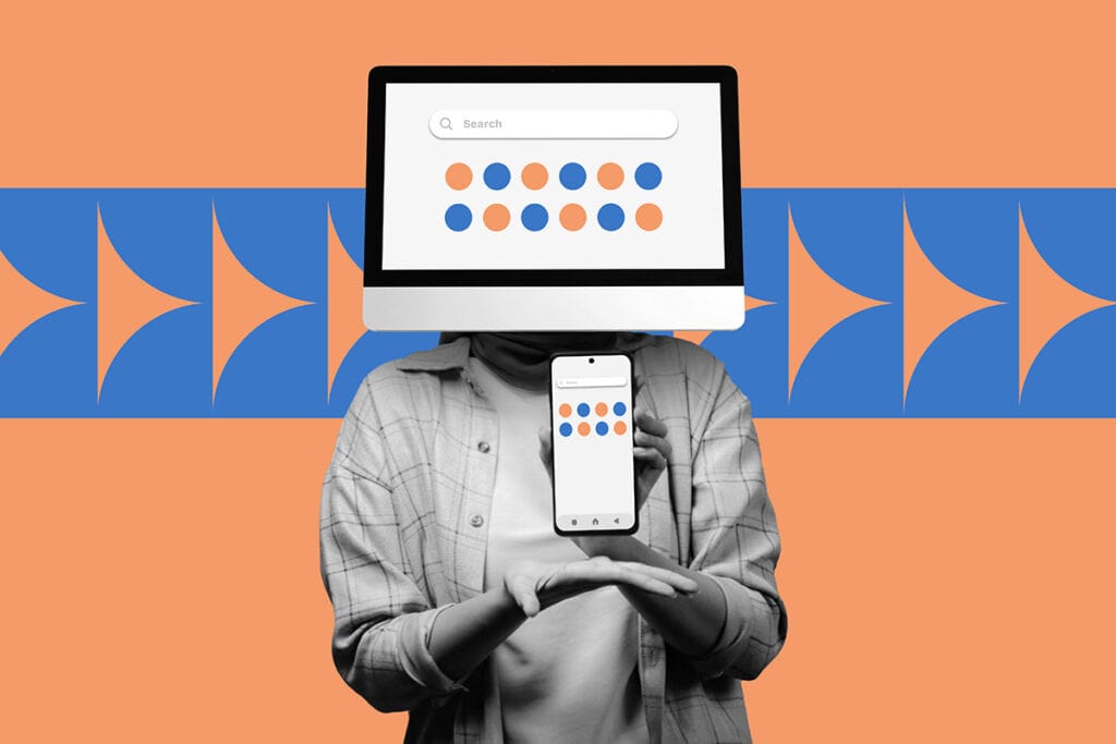
When it comes to website design, it’s easy to think that more content, more images, and more features will engage visitors. But in reality, sometimes less is more. White space also called negative space is the empty area around elements on a page, and it’s one of the most powerful tools in web design.
White space isn’t wasted space. It’s a strategic element that helps guide users’ attention, improve readability, and ultimately increase conversions. Brands that overlook it risk overwhelming visitors and diluting their messaging.
How White Space Enhances User Experience
- Improves Readability: Adequate spacing around text and images makes content easier to digest. Visitors are more likely to stay on your site when information is clear and approachable.
- Draws Attention: White space naturally highlights the most important elements, such as call-to-action buttons, headlines, or product features. It subtly tells users where to focus.
- Conveys Sophistication: Minimalistic designs with well-balanced white space feel modern, professional, and trustworthy. Many premium brands use white space to communicate quality and confidence.
- Reduces Cognitive Load: When a page is cluttered, users must work harder to process information. White space helps visitors navigate content effortlessly, making interactions more enjoyable.
Tips for Using White Space Effectively
- Balance is Key: Ensure that your layout isn’t too sparse or too crowded. Every element should have room to breathe.
- Focus on Hierarchy: Use white space to separate sections and emphasize important content, guiding the user naturally through the page.
- Responsive Design Matters: White space should adapt across devices, ensuring your website looks clean and intuitive on both desktop and mobile.
- Combine with Typography: Pairing clear fonts with ample spacing enhances readability and strengthens your brand’s visual identity.
White Space and Conversions
Strategically implemented white space can directly impact conversions. By drawing attention to key actions like signing up for a newsletter, making a purchase, or booking a service users are more likely to take the desired step. Studies show that websites with thoughtful white space around call-to-action buttons experience higher click-through rates.
At Fresco Creative, we understand that design is more than aesthetics it’s about creating experiences that convert. We carefully consider every element on a page, using white space to highlight your brand’s message and guide your audience toward meaningful action.
Ready to make your website more effective with smart design? Contact Fresco Creative today and let’s craft a website that’s visually stunning, easy to navigate, and built to convert.