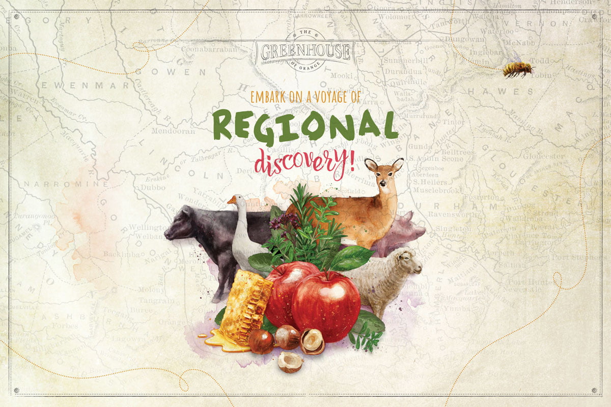
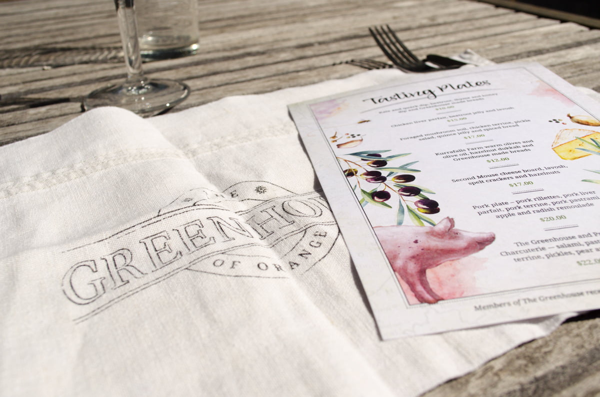
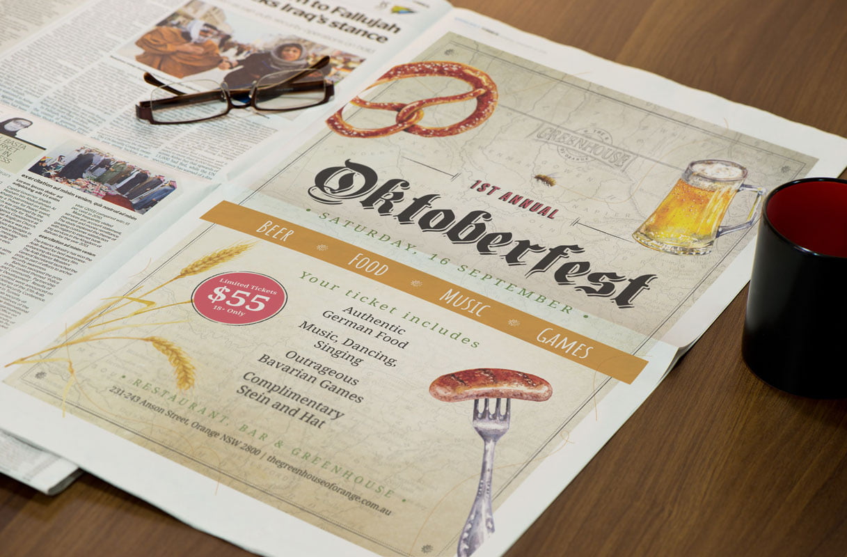
Fresco Creative were recently tasked with designing a logo and brand strategy for Orange’s new dining precinct that communicated their ethos of showcasing regional produce. We developed the logo, website, menus, membership cards, forms, signage and advertising strategy using a design style that showcased their paddock to plate philosophy. Our designers developed a hand-illustrated illustration library of animals, herbs, fruits, wines, in a unique and recognisable way. The colour palette, pencil-work and graphic style was established from the outset and consistently applied from the initial launch. A cross-platform roll out across all aspects of the precinct was carried out. It included blackboards, way-finding signage, vouchers, Letterheads, Powerpoints, membership swipe cards and menus (incl. research, durability, sample sourcing etc). Aesthetics were steered by the brand strategy and positioning statement. Our design team produced a clear style sheet t ensure the consistent application of the brand. We also worked on the website design and development including a MailChimp eNewsletter template. The client also wanted social media profile assets and event campaigns (eg. Oktoberfest etc) and functions kits for Social, Weddings and Corporate events.