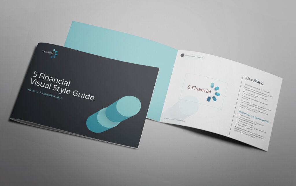
5 Financial came to Fresco Creative wanting a full logo overhaul after trying and failing with some generic online logo generation websites. They needed a bespoke logo that was crafted to suit their unique situation and brief. Their old company name was 5 Pillars Financial so they wanted the idea of the 5 pillars to be the central concept behind the logo, rather than being spelled out as the actual company name.
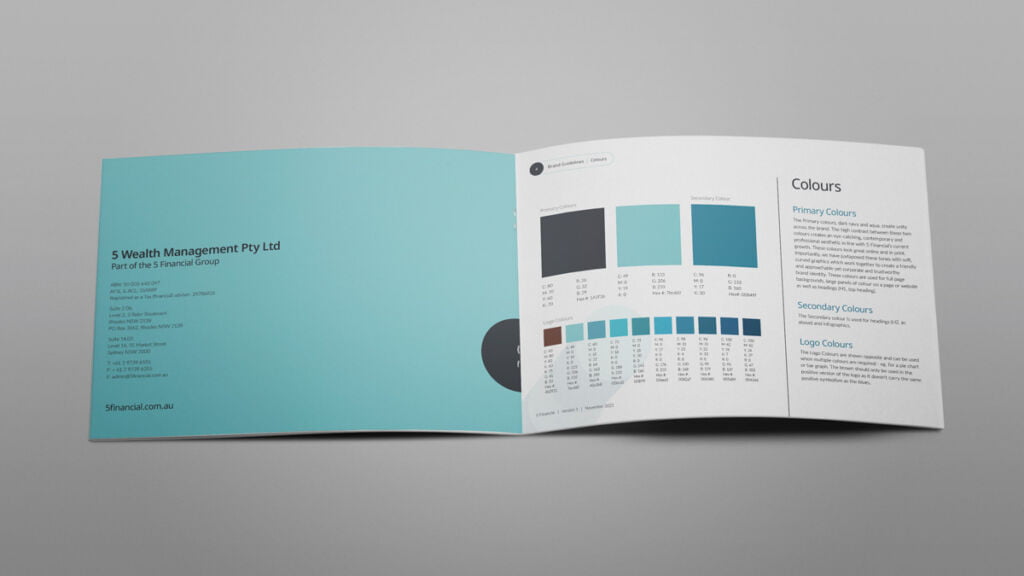
They wanted to keep a blue theme as a link to their previous branding so that the brand refresh would feel more like an evolution. We came up with an icon design showing a top-view of 5 pillars with subtle shadowing and 5 different blues. We added typography in a way that tucked neatly inside the icon so there was unity between the logotype and the icon.
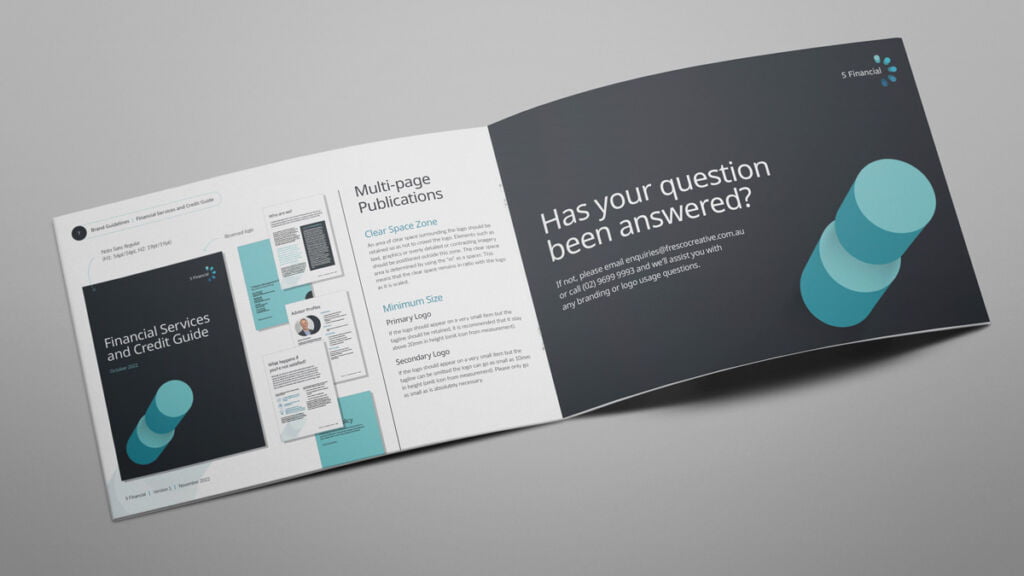
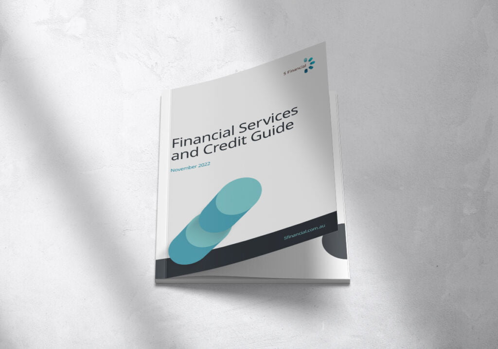
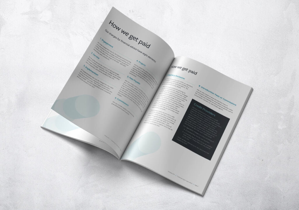
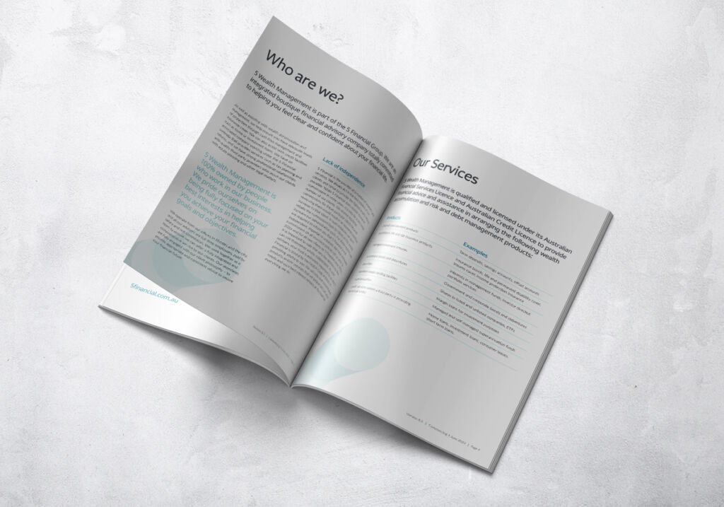
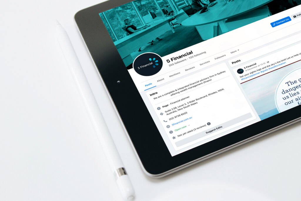
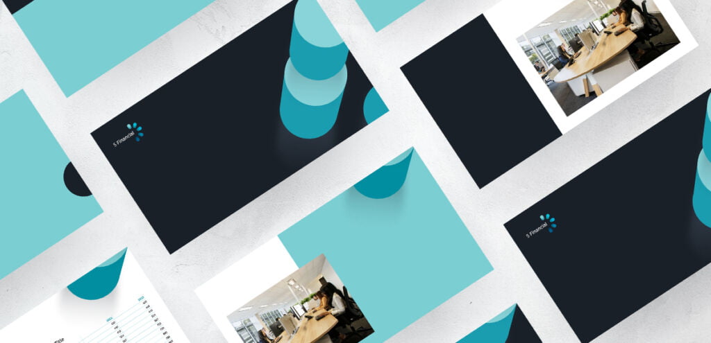
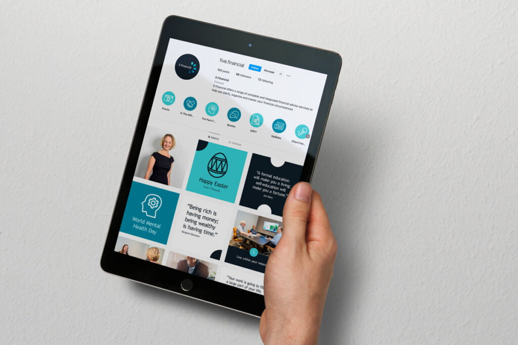
5 Financial were thrilled with how everything turned out and we went on to create a Financial Services Guide, Social Media profile images, banner and tiles as well as PowerPoints and a full style guide for their brand.
“We were really happy with our logo and are very much looking forward to getting our branding in order.” – Miranda, 5 Financial
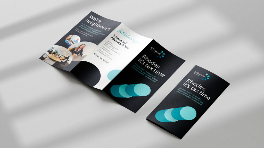
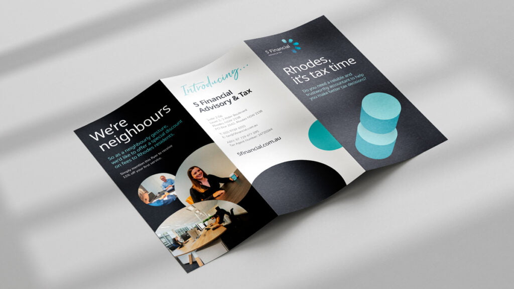
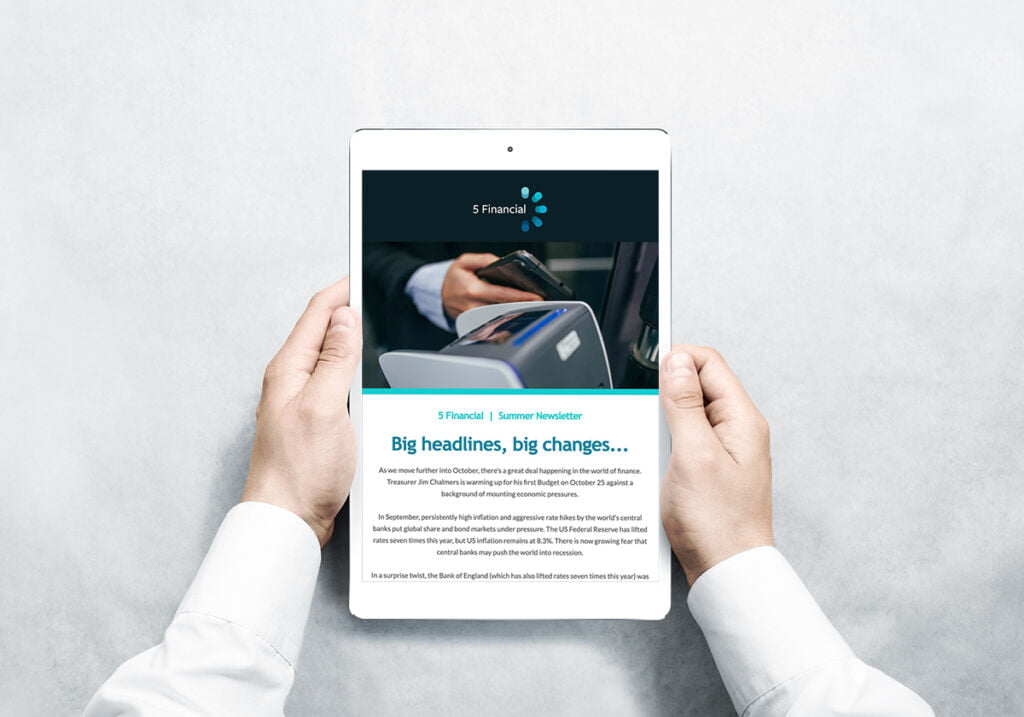
We later prepared a direct mail flyer for their local community in Rhodes which received positive feedback and generated some great leads for their Tax and Advisory arm.
“Thank you for the work you did on our accounting/tax flyer! We’ve had good feedback from it and it’s generated some good leads for us ???? – exactly what we were hoping for. Yay! Thanks again.” – Miranda, 5 Financial