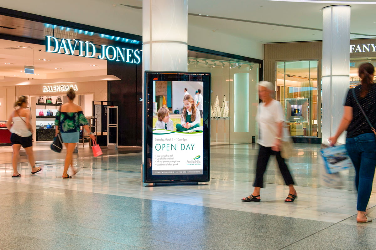
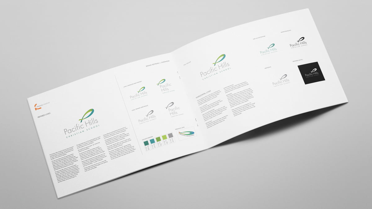
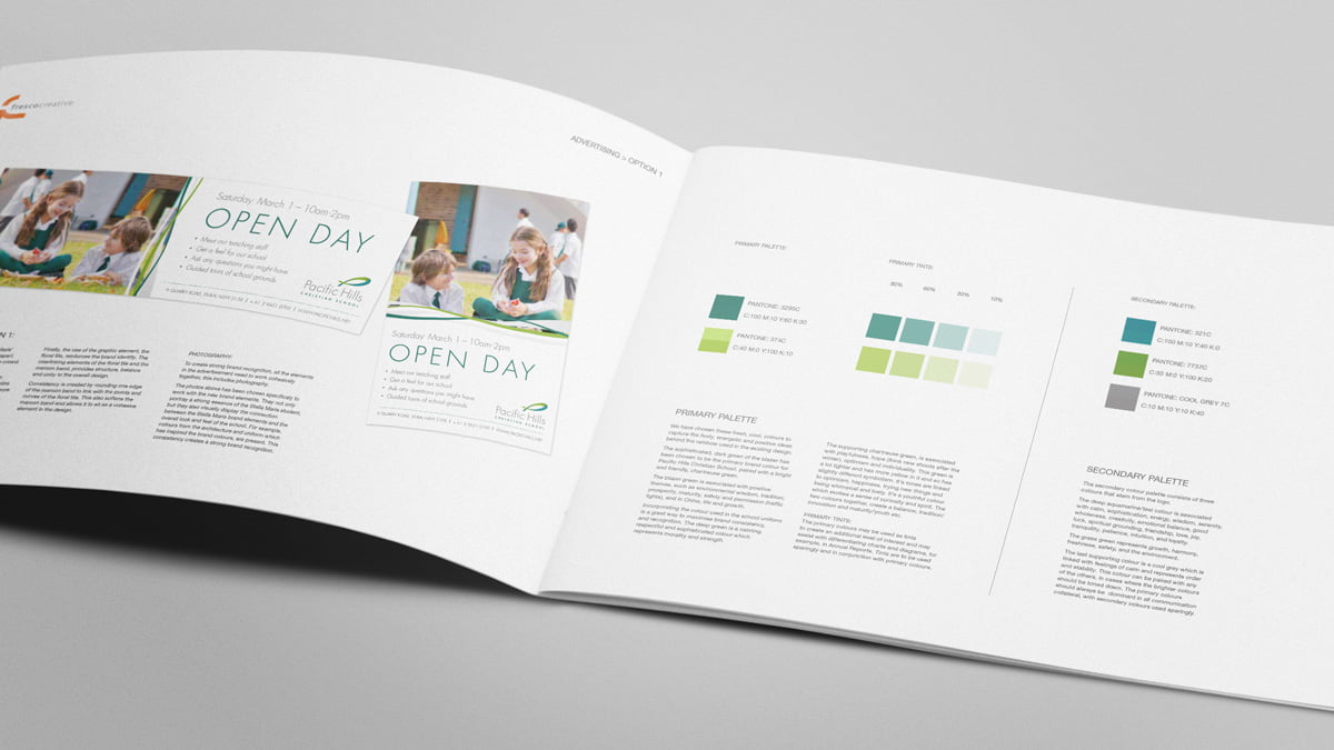
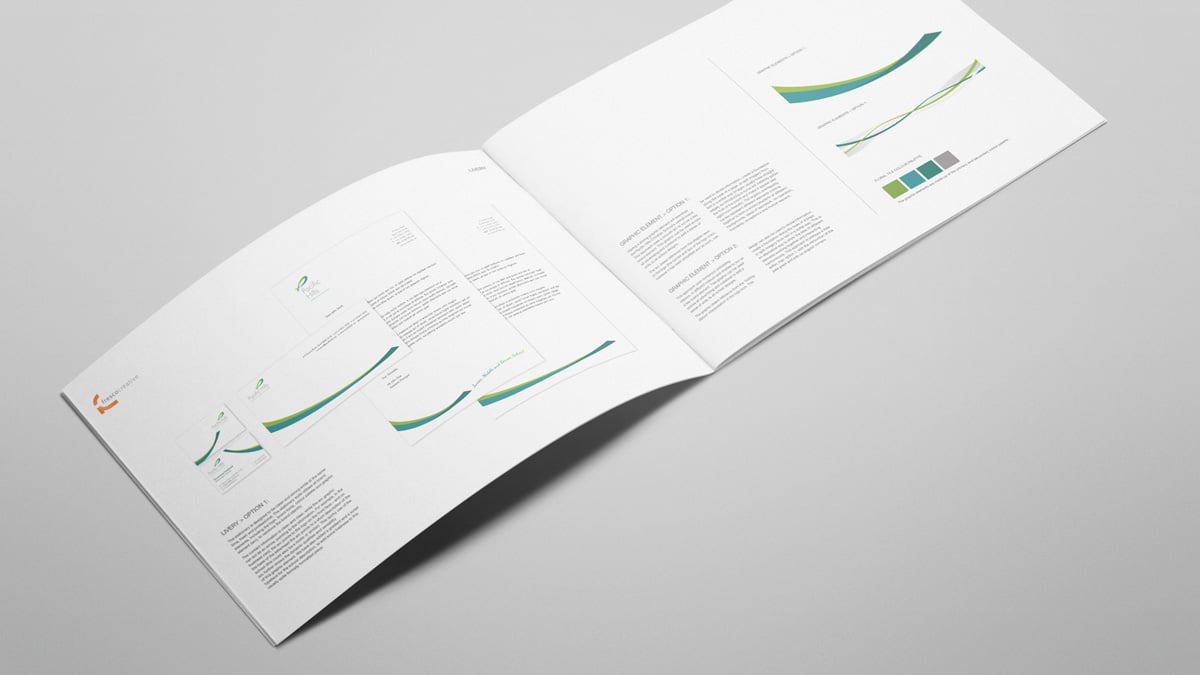
Fresco was tasked with redeveloping the Pacific Hills Christian School logo to be stronger, cleaner and easier to read, whilst maintaining the symbolism and energy of the previous designs. We also developed a new Style Guide which was put to the principal for deliberation.
“Yes to the palette. We really like it. Yes to the font. We also really like it. Yes to the simple, open, clean, light feel to the logo. I am deeply grateful to you and to Fresco Creative for all of our dealings with you. It has been marked always by a timely response, clever solutions, professional and generous communication and helpful reality checks. Thank you for your patience with us during this project and for the part Fresco Creative has played in helping our School to arrive at this point.” – M. FitzGerald, Development Officer, Pacific Hills Christian School
