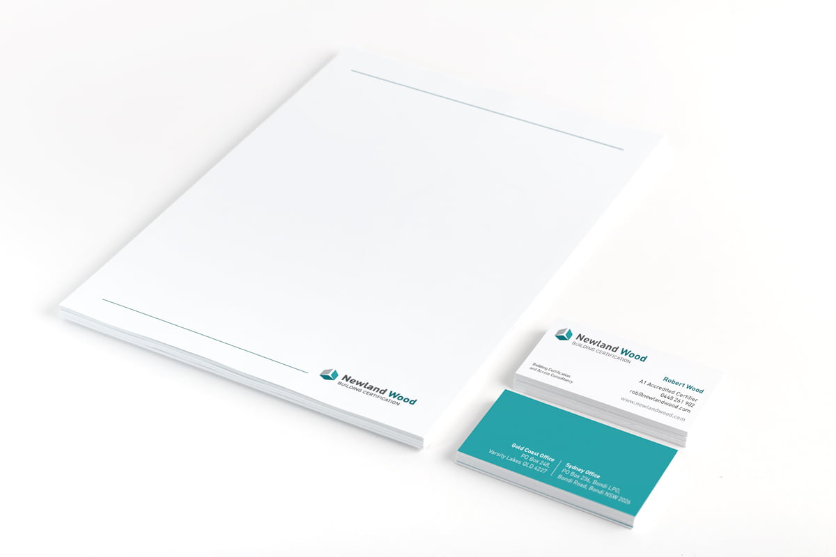
Newland Wood Certification and Access Consultancy came to Fresco to refresh their brand identity to better reflect the size and professionalism of their company after a period of strong growth. We developed a logo inspired by the idea of the building block. The main icon – made up of three leaves or bricks – represented the multiple levels of consultancy, and roles in the building approval and access certification process. The Building Certification logo and main brand colour was teal and Fresco also developed a sub-brand for Newland Wood Access Consultancy in purple to differentiate the two ‘arms’ of the company. The new icon design and typography resulted in a smart, contemporary and trustworthy feel.