Graphic designers are in a unique position to be at the cutting edge of new technologies and evolving design trends. Colour is one of the major emotional languages used by graphic designers and has a powerful influence over intended meaning in visual messaging!
Pantone has recently announced its colour of the year for 2024, and it is definitely ‘an about-turn’ from last year’s bright and vibrant colour, Viva Magenta!
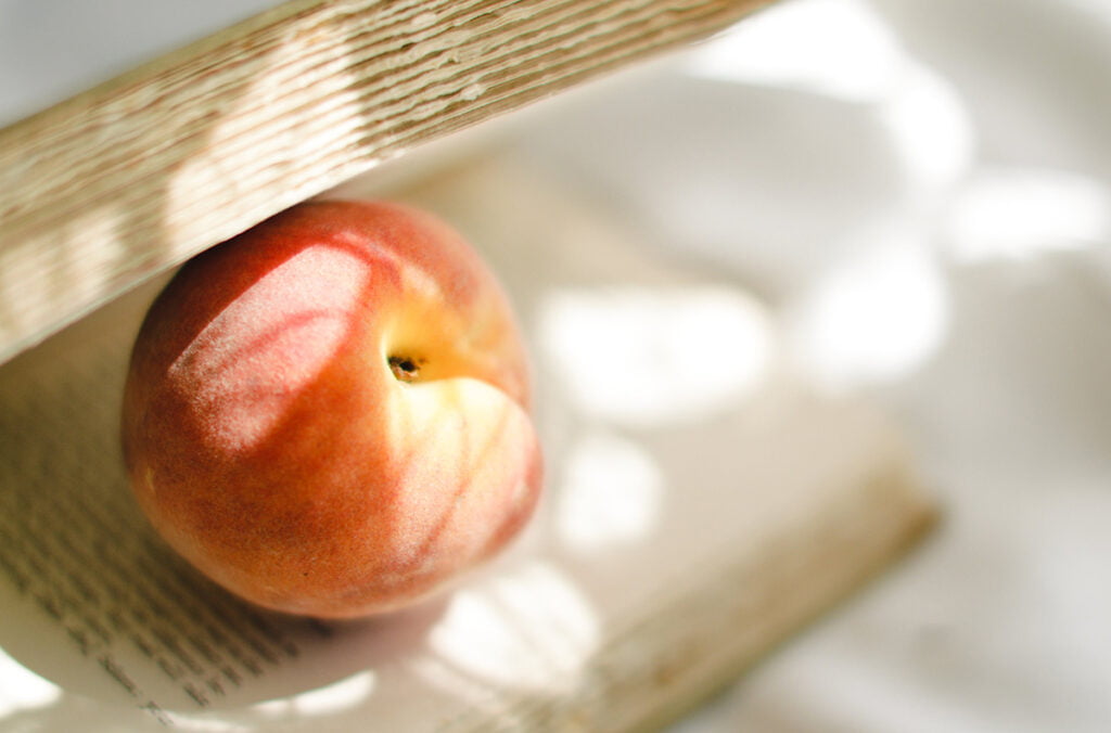
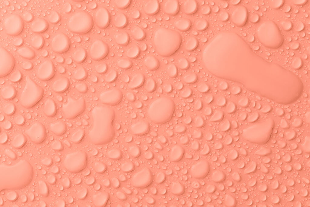
Pantone has named ‘Peach Fuzz’ as the colour of 2024. According to Creative Review the soft, nurturing pastel orange that is ‘Peach Fuzz’ is said to “inspire interaction and encourage people to reach out and touch, a sensation mirrored in the feathery textures seen in the hero imagery.”


Executive Director of the Pantone Colour Institute, Leatrice Eiseman says that Peach Fuzz “echoes our innate yearning for closeness and connection”. The colour is said to capture our desire to nurture ourselves and others, and its velvety peach tone enriches the mind, body and soul.
So why has ‘Peach Fuzz’ been chosen by Pantone as their colour of 2024?
Pantone claim that ‘Peach Fuzz’ evokes modernity. They say that the appealing peach hue inspires things such as belonging, calmness, healing, and enrichment. The softness of ‘Peach Fuzz’ is explained as being quietly sophisticated as well as having a depth that brings beauty to the digital world. It is “poetic and romantic, a clean peach tone with a vintage vibe that reflects the past yet has been refashioned with a contemporary ambiance.”


Vice President of the Pantone Colour Institute, Laurie Pressman expresses her view that in the current times of turmoil in the world there is a need for nurturing, empathy and compassion that feeds into a longing and imagining of a more peaceful future. ‘Peach Fuzz’ is selected as the 2024 Pantone colour of the year because it is thought to embody our current desire for closeness with others and to convey messages of compassion and empathy. It is talked about as being capable of eliciting a feeling of tactility.
What processes led to Pantone’s 2024 colour of the year ‘Pantone 13-1023 Peach Fuzz’?
Daily Correspondent at the Smithsonian Magazine, Sarah Kuta explains Pantone’s process of choosing the velvety and subtly sensual “Pantone 13-1023 Peach Fuzz”. Just as with each previous year a team of colour experts examine movies, art, fashion, design, travel destinations, technologies and more to determine the most up-to-date influential colours of the world. On top of this research, the team also uses forecasting tools, colour psychology research and other sources for predicting upcoming trends. Combing all these different elements allows Pantone to then narrow down options until they are left with one colour that they expect will set the right tone for the year ahead.
ABC news article, Peach Fuzz has been named colour of the year for 2024, by Dannielle Maguire highlights that the orangey, pinkish beige is a mix between a trend forecast and the company saying, “this is a good one.” Although ‘Peach Fuzz’ may not be followed by all designers it is likely that there will be more products and brands using the colour next year.
If you are keen to keep your brand fresh and up-to-date by incorporating upcoming trends, and are interested to include colours in your visual communication that express your unique values, then contact us at Fresco Creative.
