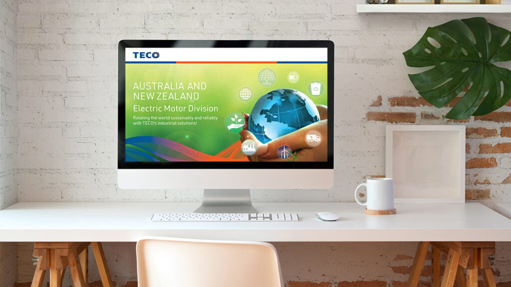
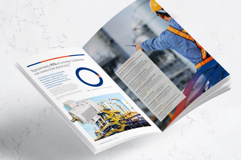
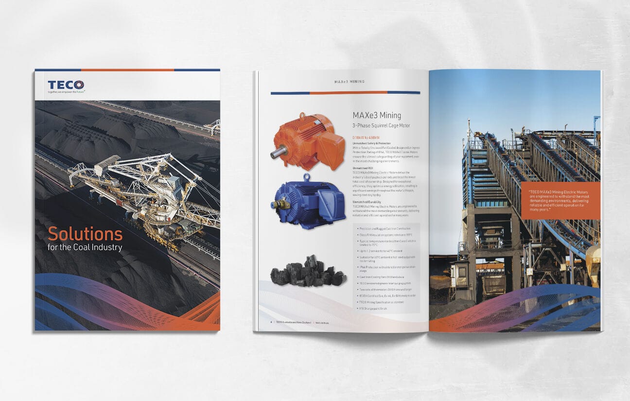
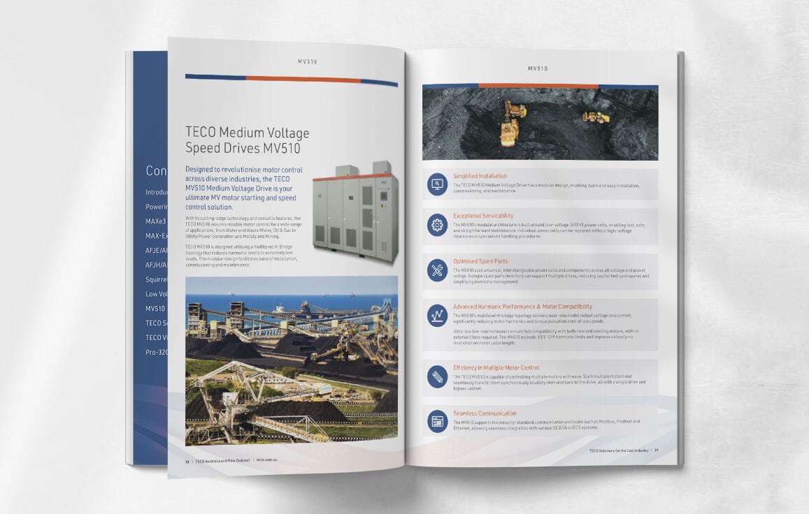
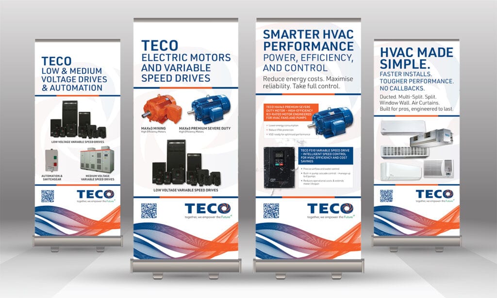
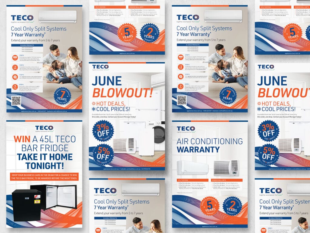
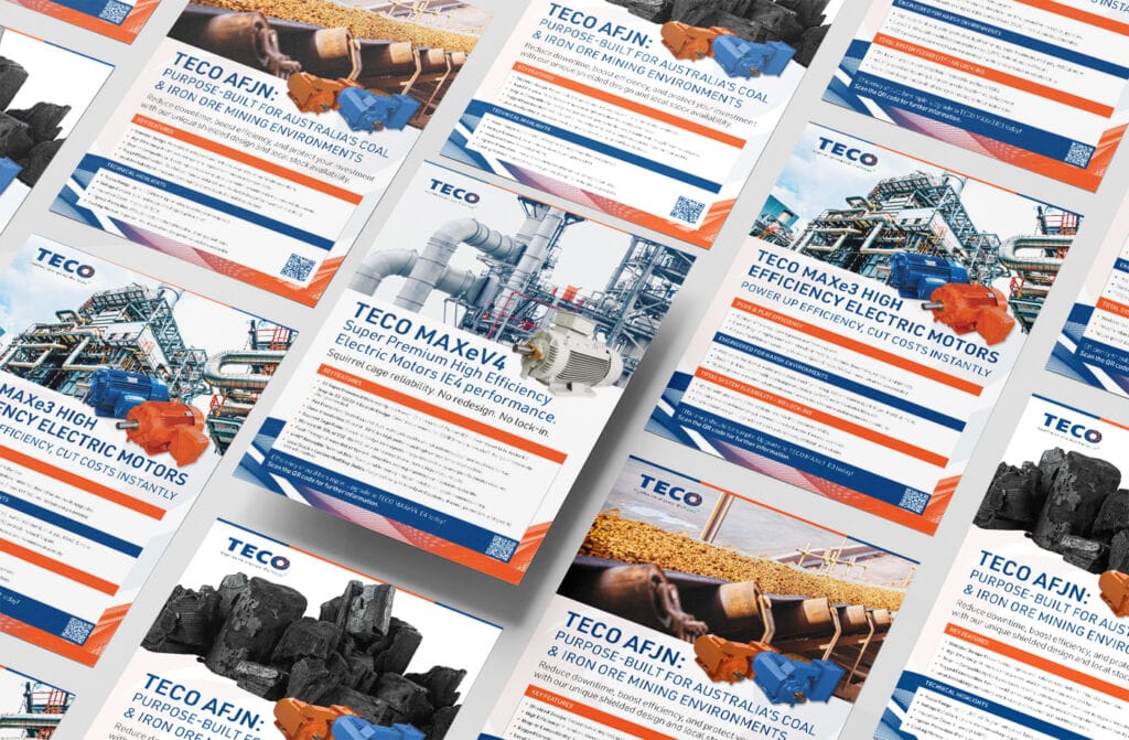
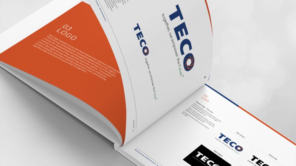
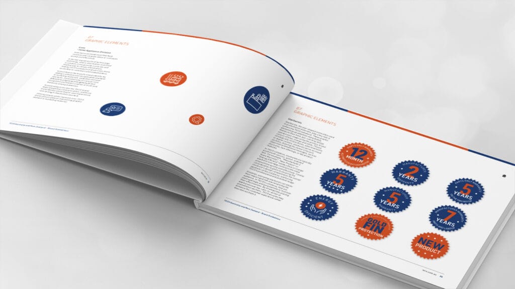
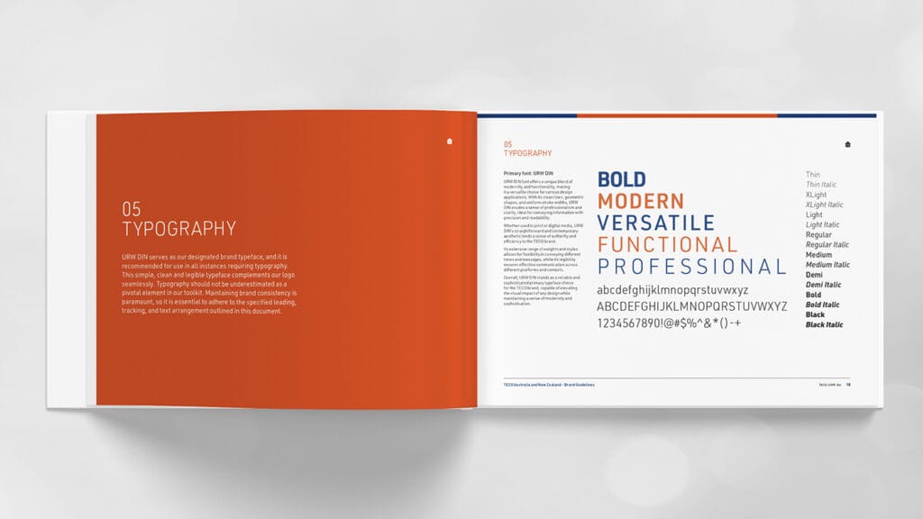
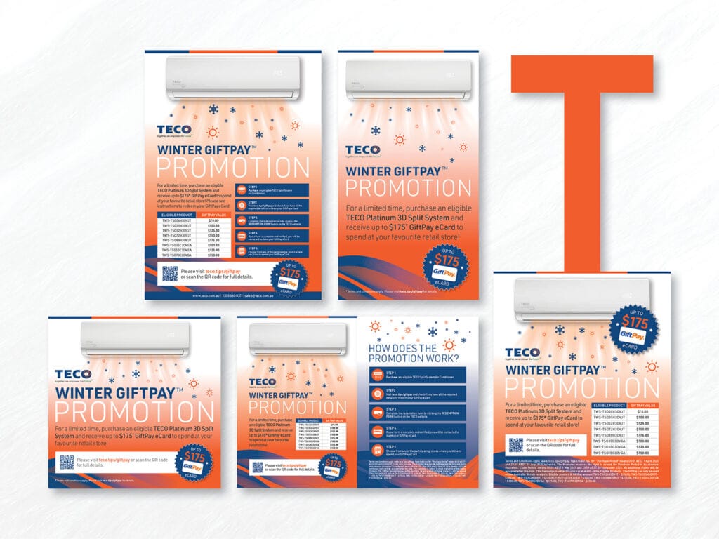
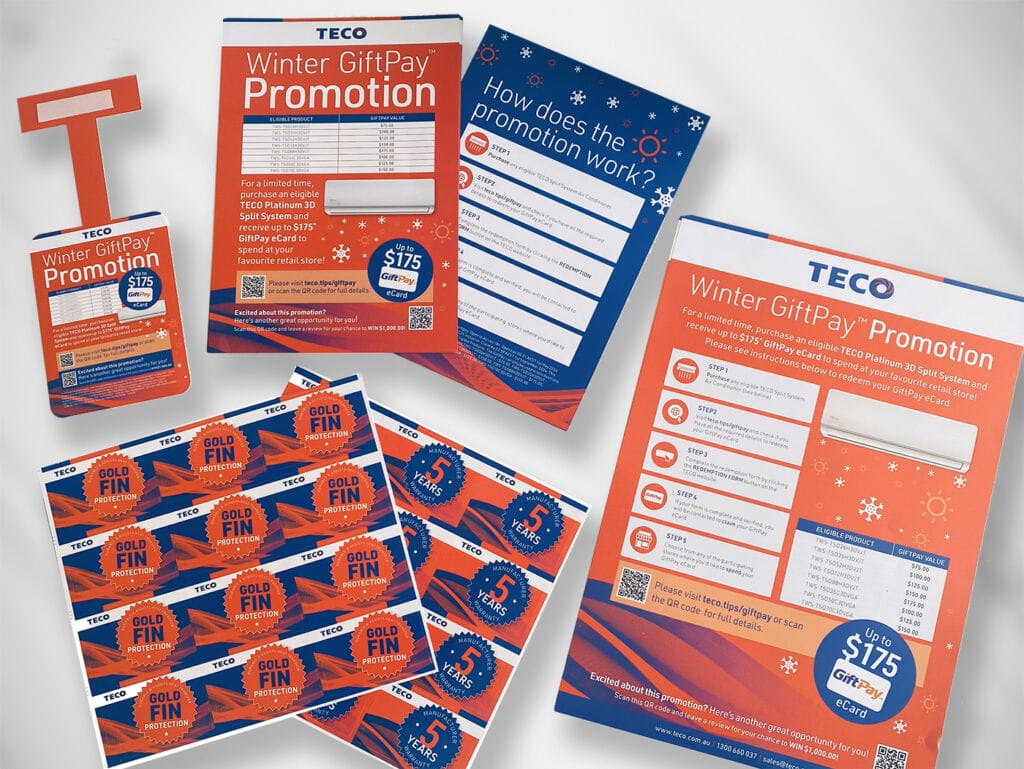
TECO is a leading supplier of Electric Motors & Variable Speed Drives, Energy Solutions and Home Appliances & Air Conditioning, supporting projects across a wide range of industries. With a fast-moving product pipeline and ongoing promotional activity, TECO requires creative that is adaptable, consistent and able to deliver across multiple channels.
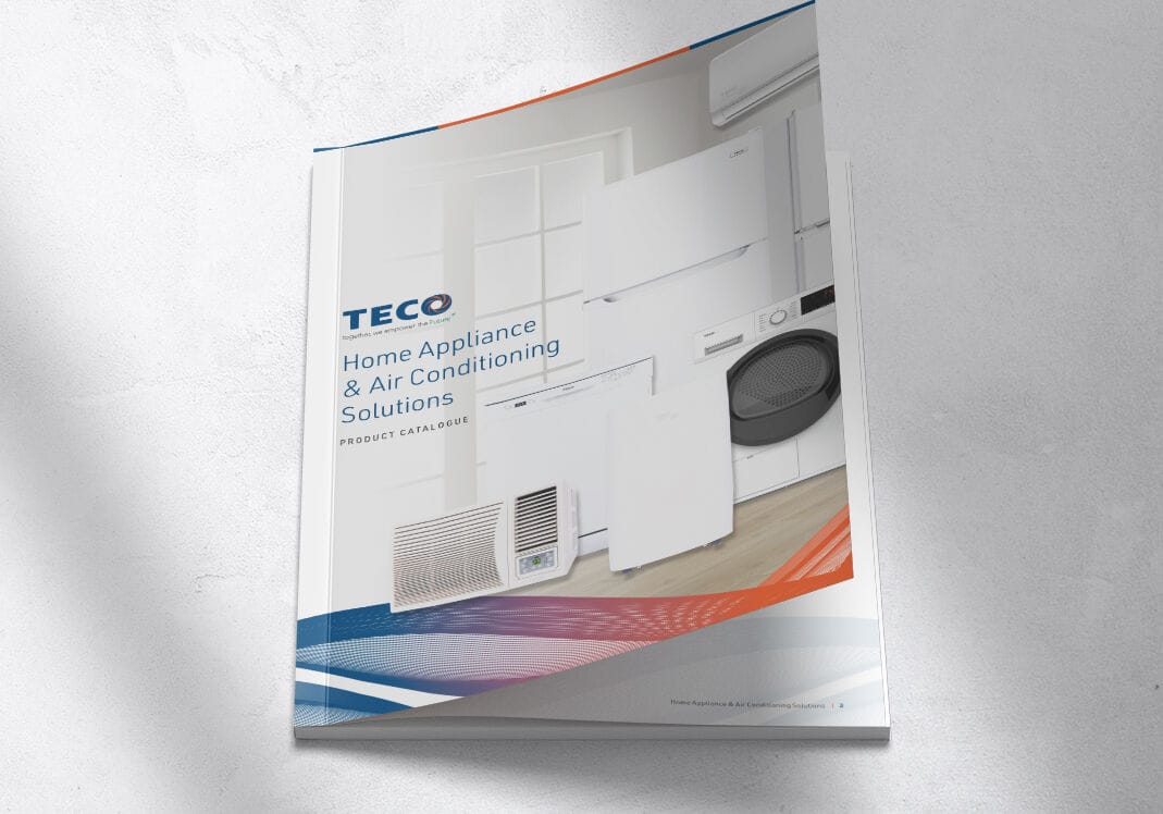
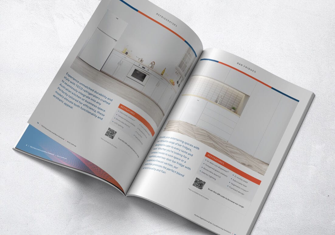
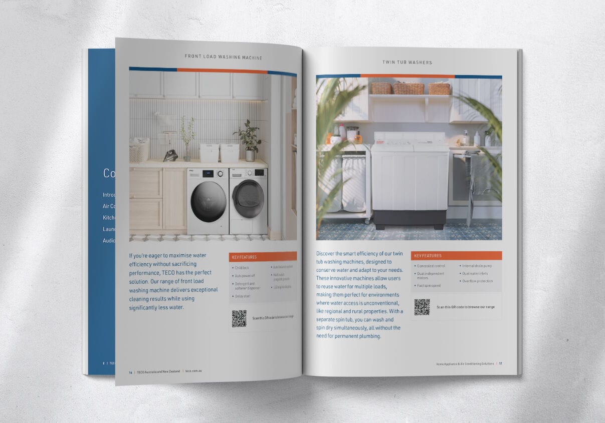
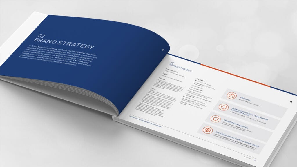
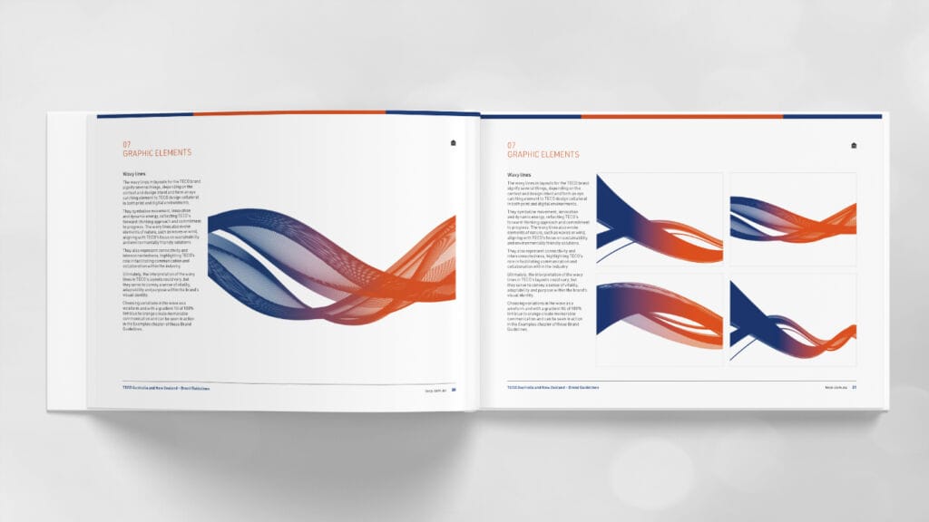
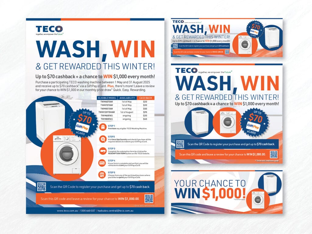
Fresco Creative works closely with TECO as an ongoing creative partner, delivering a broad range of graphic design and advertising services across packaging design, brochures, catalogues, point-of-sale, digital banners, video content and campaign advertising. Our role spans concept development through to production, ensuring each piece aligns with TECO’s brand while responding to specific campaign objectives and technical requirements.
Across multiple concurrent campaigns, we manage tight turnaround times and evolving briefs, providing reliable creative support that integrates seamlessly across print, digital and in-store environments. The result is a cohesive suite of creative assets that supports product launches, promotional activity and brand visibility, while maintaining clarity, consistency and impact at scale.
“Just wanted to take a moment to tell you both how happy I am to work with you! Really! We are truly elevating the TECO brand in the market. I’m delighted to have you as my main partners and you are all fantastic! Now, we are completely in sync”– Alessia, TECO


