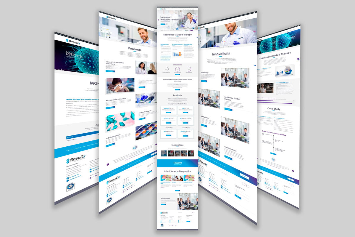
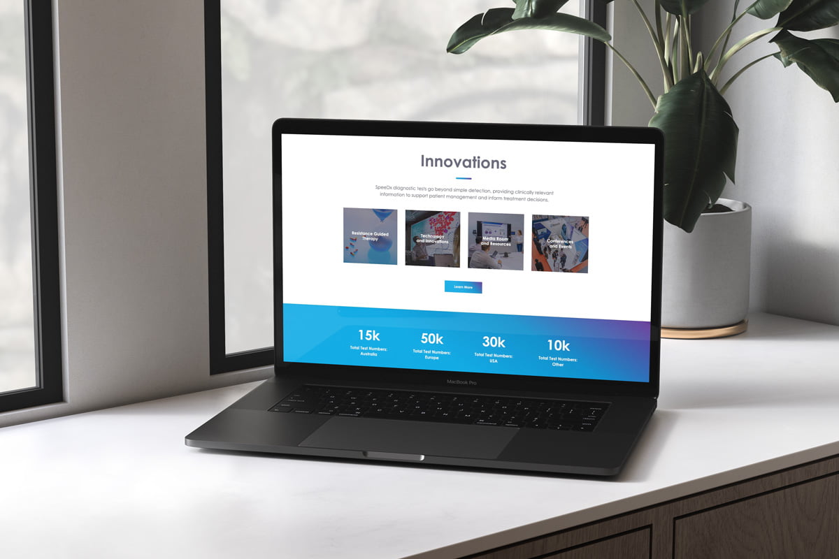
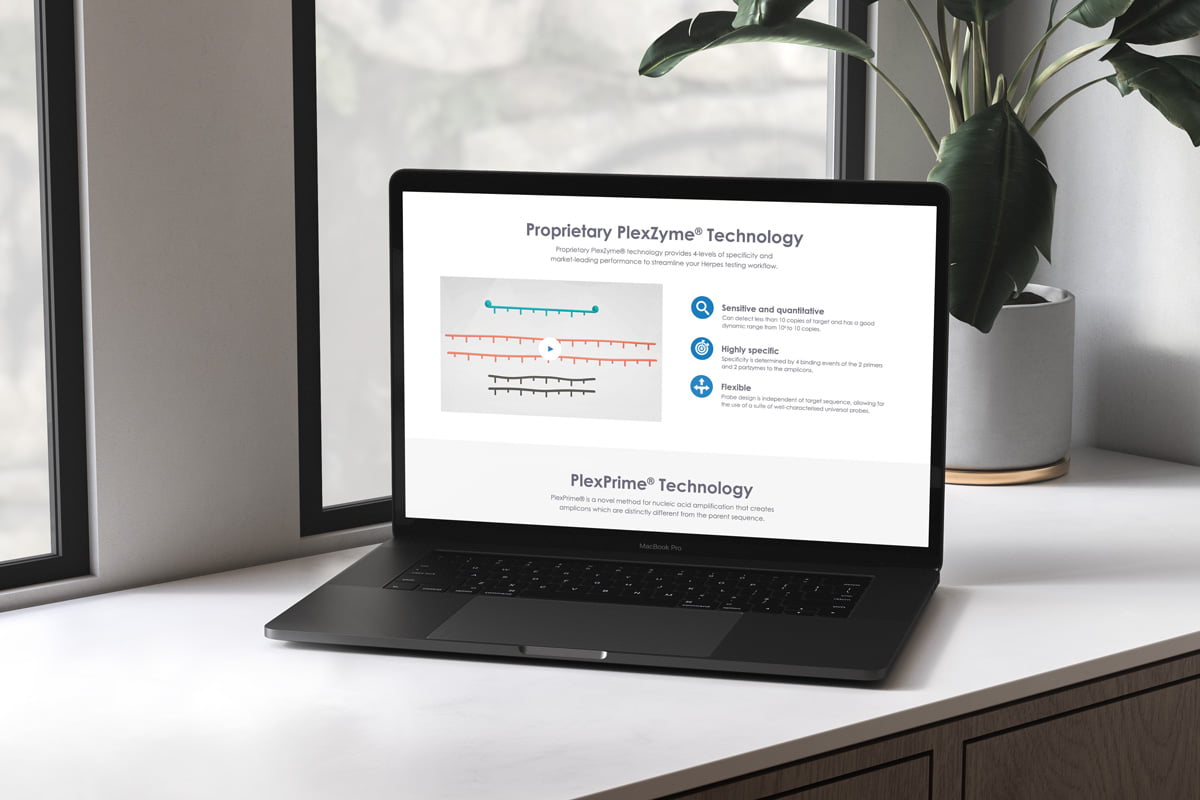
SpeeDx approached Fresco Creative for help overhauling their website in the lead up to their launch in the USA. They identified that their primary users were diagnostic lab directors, clinicians, industry/academic and patients/general public. These users were finding it difficult to learn about the company and the topic of resistance-guided therapy – particularly disease areas and corresponding diagnostic products created by SpeeDx, available to patients. We developed a modern site with interactive pie charts and bar graphs to improve the UX and layering and animated sliders to add depth and movement to the design.
We improved the typographic hierarchy and reorganised the sitemap to reduce page length and simplify navigation. Rather than having a vast collection of disease/product types we introduced overview pages which grouped similar diseases by ‘type’ – such as Respiratory, STIs etc – to help users find what they were looking for and sub-divide their many disease areas. The issue of choosing imagery to represent diseases was addressed by showing the microscopic level of the diseases, rather than patients or symptoms. They also required geo-location triggers/page hiding for some products that were not available in the USA, which was successfully delivered. The site was well-received and deemed a vast improvement on their previous iteration, bringing them up to date and allowing the brand to hold their own in the competitive global arena of resistance guided therapy.
“Thanks for all the great work together and supporting us creating the new website, it looks amazing.” – Katalin, SpeeDx Diagnostics
