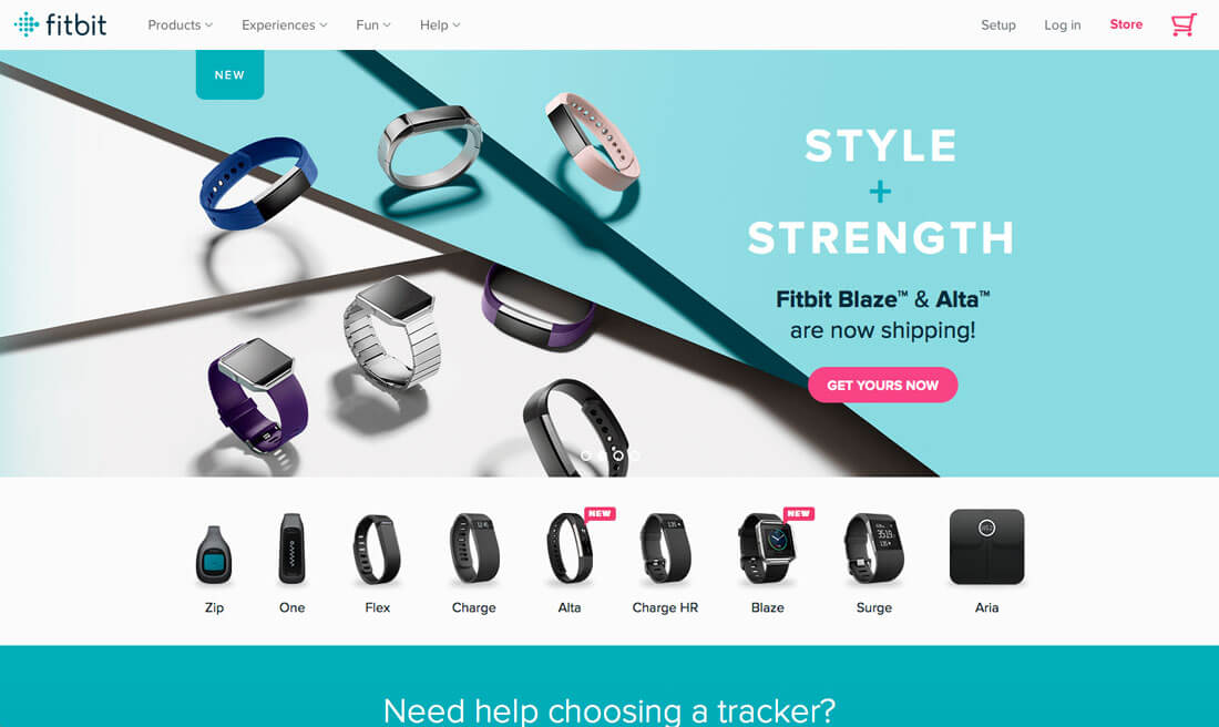
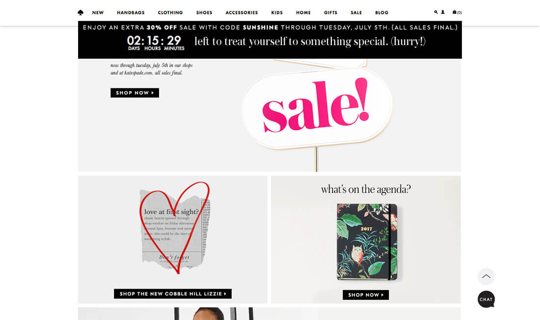
Consistency will make your design better, easier to use, and practically invisible. It gives the user plenty of room to experience the design in the way you intend.
Designing for consistency is a no-brainer in some cases and a little trickier to understand in others. Quite simply, consistency is the thread that ties together elements in a single design. It also ties together designs across a single campaign or brand, creating a product that is distinguishable, usable and effective. Take special note of all the examples below, each brand is a leader when it comes to consistent and usable design.
1. Dominant and Secondary Colours & Hues
There’s a reason there’s so much information available on creating great color palettes. Colour can be one of the key visual factors that links a brand to visual treatment.
A special colour identifier can tell users who you are at a glance. Just think of how some of the biggest brand in the world – Coca-Cola, Facebook, T-Mobile – are identified by a color. Would you even recognize these brands without their signature hue?
Good colour use also helps users move through a website and know that they are still in the right location. If every click took you to a page with a new color palette, would you question if you were in the right place?
To create a great color palette, pick a dominant color and use concepts of color theory to add a secondary color or two. Then jot down a quick set of style and usage rules for each colour and how it will be used throughout the design. Stick to the rules and you have color consistency.
2. Typography Size, Spacing and Position
Just as color should be based on a palette with style rules, typography needs the same treatment. And easy for you, the concept is the same as with colour.
- Pick a dominant typeface and size.
- Choose secondary typefaces and sizes.
It can be a little more complex than that for typography for the web, but you get the idea, right? When it comes to web styles, you should associated specific type treatments, size, spacing and positioning with the CSS so that each tag (such as h1, h2, h3, body, etc.) calls the correct type option.
Further type that’s used in a single location – such as navigation – should be consistent throughout that element. Users will be rather confused if every navigation element uses a different typeface. This consistency applies across the site; all like items should use the same text treatments.
3. Size and Relationships of Elements
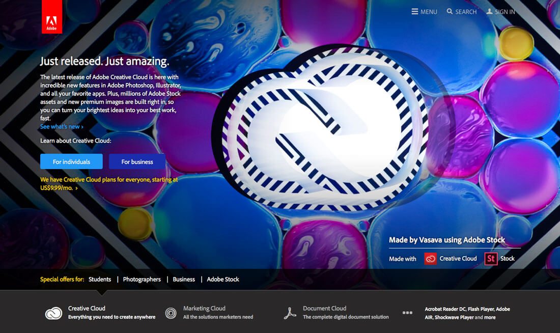

How big are the elements in your design? Are all of the buttons the same size? How about headlines and photos?
The size of elements should be dictated by style and remain the same for every usage. (Just think how funny your slider will look if you try to put in photos with different shapes. It’s not going to work.)
Common size and relationships between elements help users see patterns and create visual flow. These commonalities create harmony and balance that make a design easy to digest and keep users engaged.
4. Space and How It Is Used
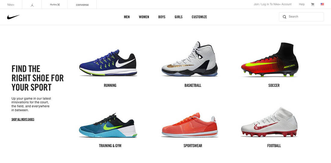

Just as important as the size of elements is the space between them. There’s nothing more distracting than a design where elements just seem dumped on the canvas with no organization or rules – some photos overlap while others might have plenty of space between them.
The best way to establish – and stick to – common spacing rules is by using a grid system. This set of invisible lines will help you determine where and how to place elements so that very single block, from text to buttons to images, falls into perfect harmony.
While you’re thinking about space, remember to check for consistent spacing both vertically and horizontally. This includes looking at the relationship between like elements and ones that are different. (It’s OK to have spacing rules for each.)
5. Visuals That Cross Mediums
Brand visuals, such as images and illustrations, should carry across mediums. Whether you are designing a project for a website or brochure, billboard or social media, the visual identity of the brand should not change.
This often involves using a common photo set. Some brands have detailed rules for how visuals are used – from color overlays or watermarks on all images to a certain aspect ratio for all photos. Regardless of what you want your style to be, the important thing is to use is regardless of the location.
To do this most effectively, it is important to have a great visual deck packed with high quality, high resolution imagery that you can use and reuse.
6. User Patterns That Work Naturally
Your design needs to work like other similar designs and follow accepted user patterns. Too often designers want to do something different with the way things work; don’t fall into this trap.
If a website or app or printed element works like users expect, they can interact with it easily. They’ll know what to do and the design becomes somewhat invisible as usability shines through. (This is your actual goal as a designer.)
There are four types of commonly accepted patterns to think about:
- Content patterns: Style and tone of the content and your brand
- Markup patterns: HTML and CSS that you need to design across pages and the entire website
- Design patterns: The look of every element in the design and all associated styles
- User patterns: How users engage with design elements such as buttons, menus or icons
7. User Interface Elements That Stick
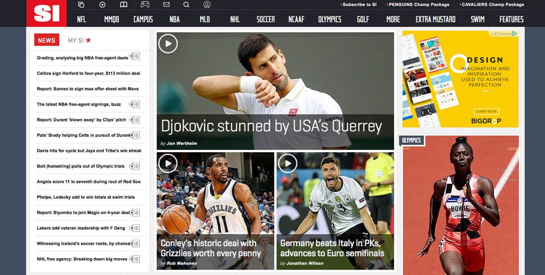

This is not sticky navigation, but it is a similar idea.
Every interaction and interface element should behave in the same manner.
- Links open directly or in a new tab (choose one for every link)
- Buttons are the same color throughout
- Navigation stays in the same location and includes the same options
- Footers and sidebars should hold a specific location and size (don’t make the footer huge on one page and tiny on the next
- Icons are recognisable and does what users expect
- Clickable elements are always clickable (such as photos that link)
The list about is a springboard that showcases all the tiny details you need to think about in terms of stickiness and usability. Remember, if you allow an element to perform an action, it should likely be universal.
Conclusion
Design consistency creates the structure that users desire. It also creates a framework that users understand, contributing to overall usability and engagement.
It starts with a set of rules and style guide for each project. Even if you work alone, create a list of rules for how a project will use colour, type, size, space, user interface elements and interactions. It will speed up the design process for you and lead to a better, more usable design.
Written by Carrie Cousins and located on the Design Shack website.
