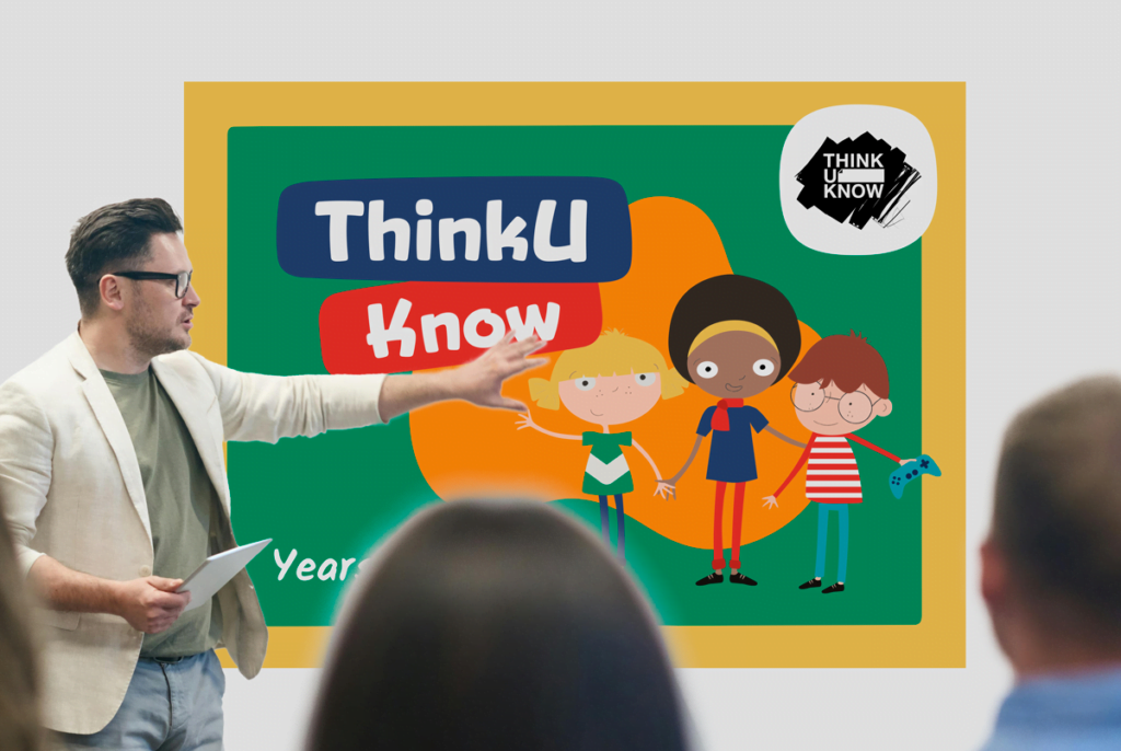
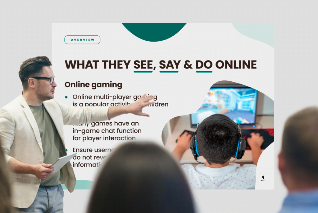
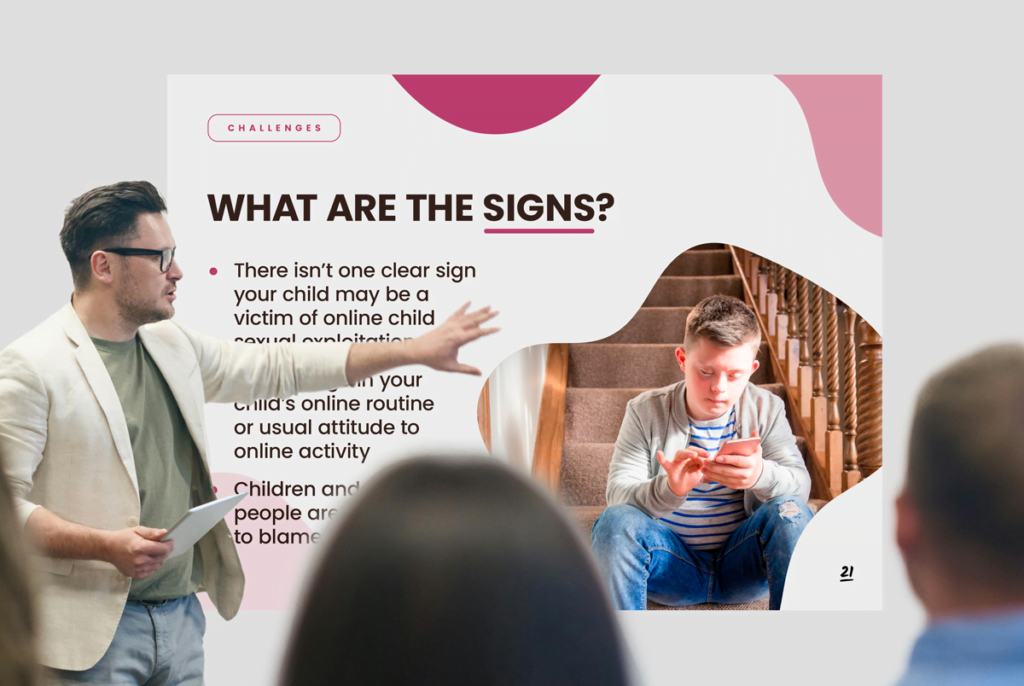
Fresco Creative won a tender process for the Australian Federal Police to produce visuals for a training program for Australian schools about online safety. The program titled “ThinkUKnow” is delivered at schools to audiences in years Foundation/Kindergarten to Year 12 and also to parents. The content is age-appropriate and based on the latest information available to the AFP. They cover topics including what young people see, say and do online, challenges, online grooming, sextortion, warning signs, how to build safe online habits and what to do if something goes wrong.
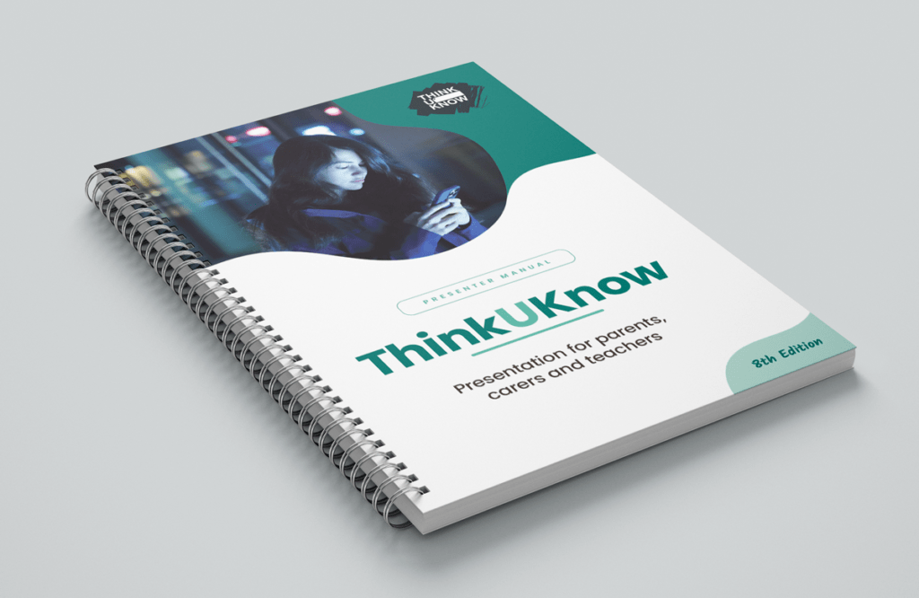
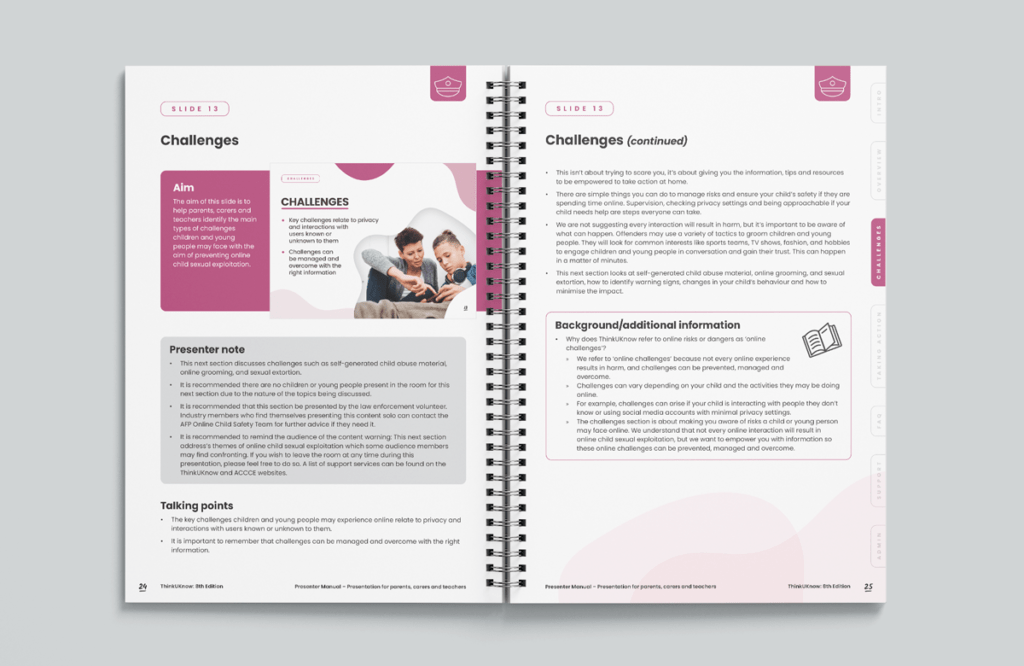
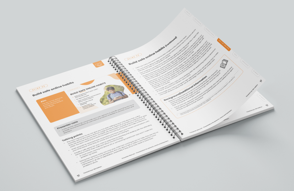
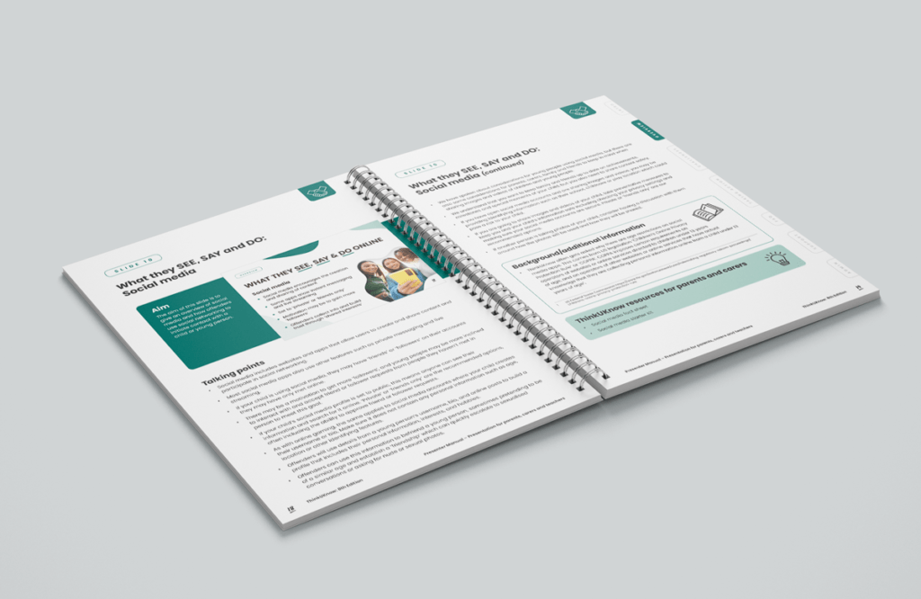
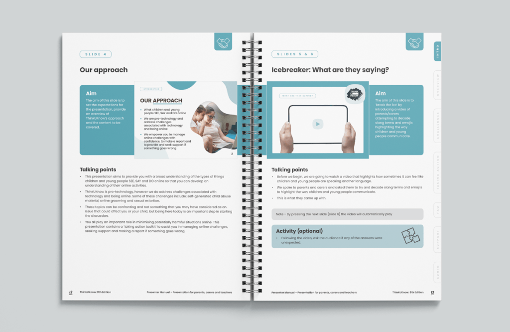
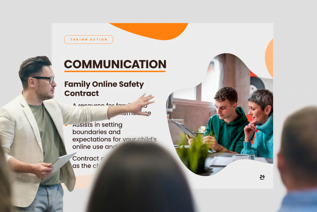
Fresco designed 11 unique PowerPoint presentations, each styled to appeal to a specific age group, with illustration styles differing in colour and complexity according to the audience. The presentations were accompanied by Presenter Manuals—one for adults and one for children—with talking notes and activities corresponding to the PowerPoints.













“It’s been great working with Fresco, the process has been easy and seamless. Fresco took initiative in areas of our content when it made sense. When we had updates to the talking points or other text in the manual, our designer would read what we wanted changed and confirm if our intent was met. Sometimes, our notes would result in incorrect grammar, our designer would understand what we wanted changed and suggest a more appropriate change or fix the grammar error. Our designer picked up on the consistency we wanted, when we had notes for certain sections and we forgot to include it in other sections, Andrea would flag this and implement these changes. Our designer was diligent with our notes, it was rare that something was missed, which is impressive since we provided close to 1,000 notes during the lifetime of the project. We have had experiences with other designers where they would miss our notes and we would have to cross check if they were implemented. When I had to cross-check to see if changes were implemented, I had a lot of confidence. The slide designs were fantastic. This is the 8th edition of the program; the last three editions have been a victim of referring to the previous material and the slides have looked very similar. I particularly liked the use of white space with the slides, not every design included the standard dot points with a graphic image on the right. Mentioning ‘K-pop’ in one of the slides designs showed that Fresco understood the audience. The adult presentation is my personal favourite, nailed the creative brief. The use of white space and flow of the images work nicely with the simple format that we require for the presentation. Overall, we appreciate that Fresco was flexible to work around our schedule. We had some delays due to staffing pressures, and we appreciate that us having to constantly change deadlines would make it difficult to manage other clients on your end.” – Nick, Team Leader Online Child Safety Team, AFP
